Local
Graphite and Colored Pencil on Paper
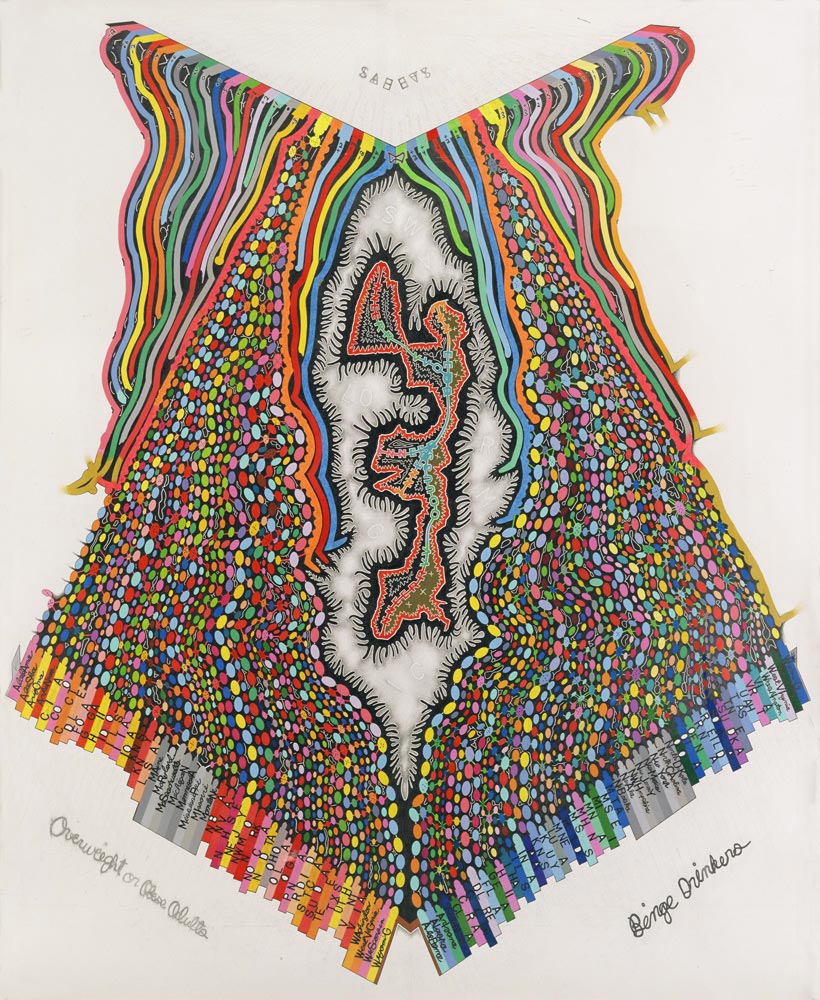
The potential relationship between state percentages of obese and overweight adults, binge drinkers, and the overall safety rating for each state in the US was the impetus for this drawing. I began by recording and marking the ranking for states in each category according to 2002/03 statistics. The ovals reflect each state’s numerical ranking. In addition, I invented a distinct method to record state percentages in each category in terms of size and color. The “stripes” for the safest state rankings at the top correspond to the number and size (eventual length) of ovals initially recorded for each. After recording and transforming this data, I looked for various visual and conceptual connections. The shape in the center is an altered representation of the top state in each category (MN, MI, LA, MS). I formed this by connecting all four states on a map in the most efficient way possible. Throughout the drawing, I outlined shapes to demarcate the inner spaces between forms – these are denoted by the thin white looping lines and are a type of pattern mapping. I also incorporated information relating to pertinent process at work in these emergent systems, such as swarm logic and the human nervous system. To this extent, I attempted to connect the human body and insect colony formations with obesity, binge drinking, and the relative safety of each US State.