
Large Works with notes
Select Exhibition Links:

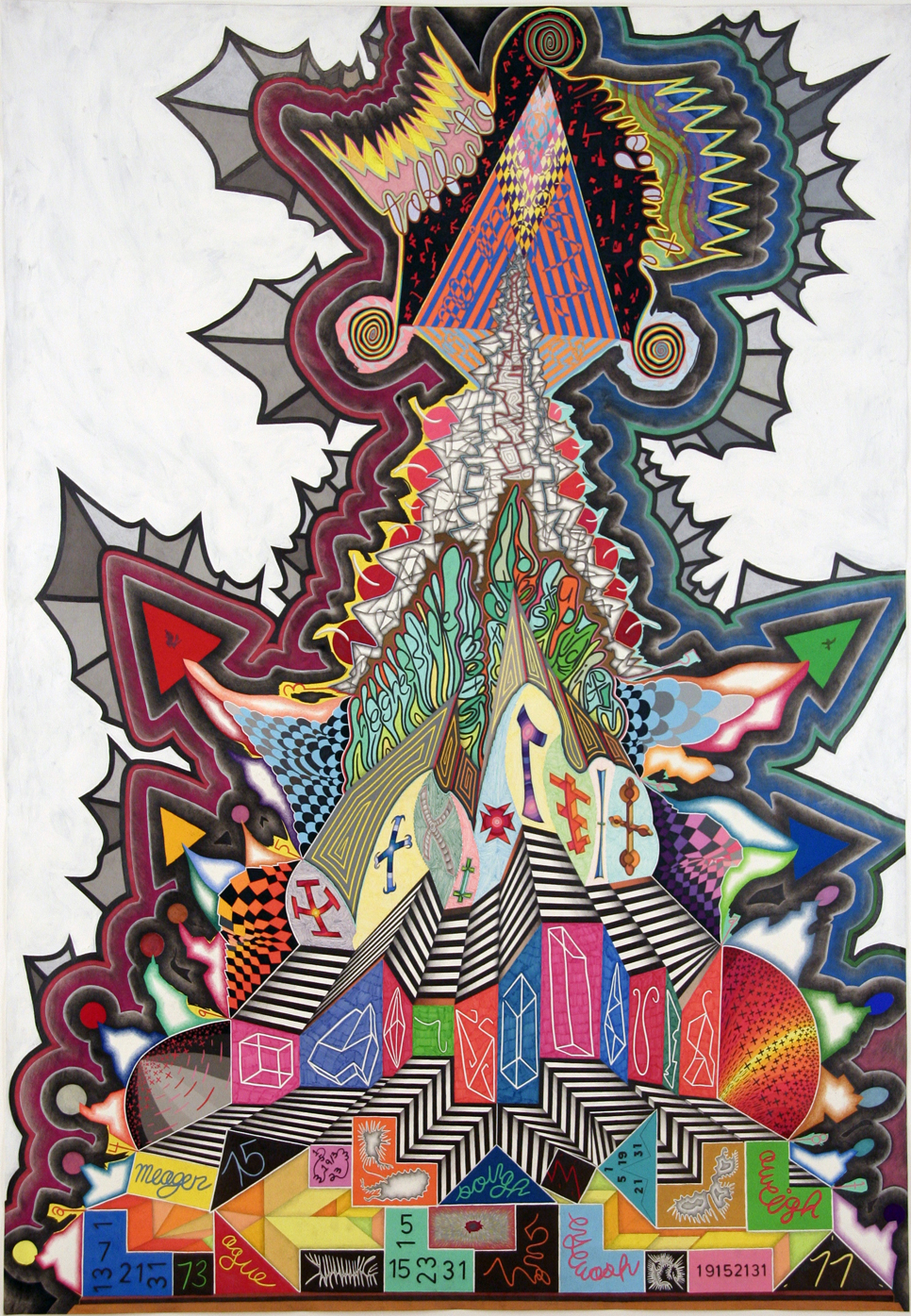
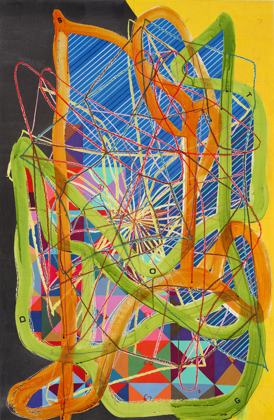
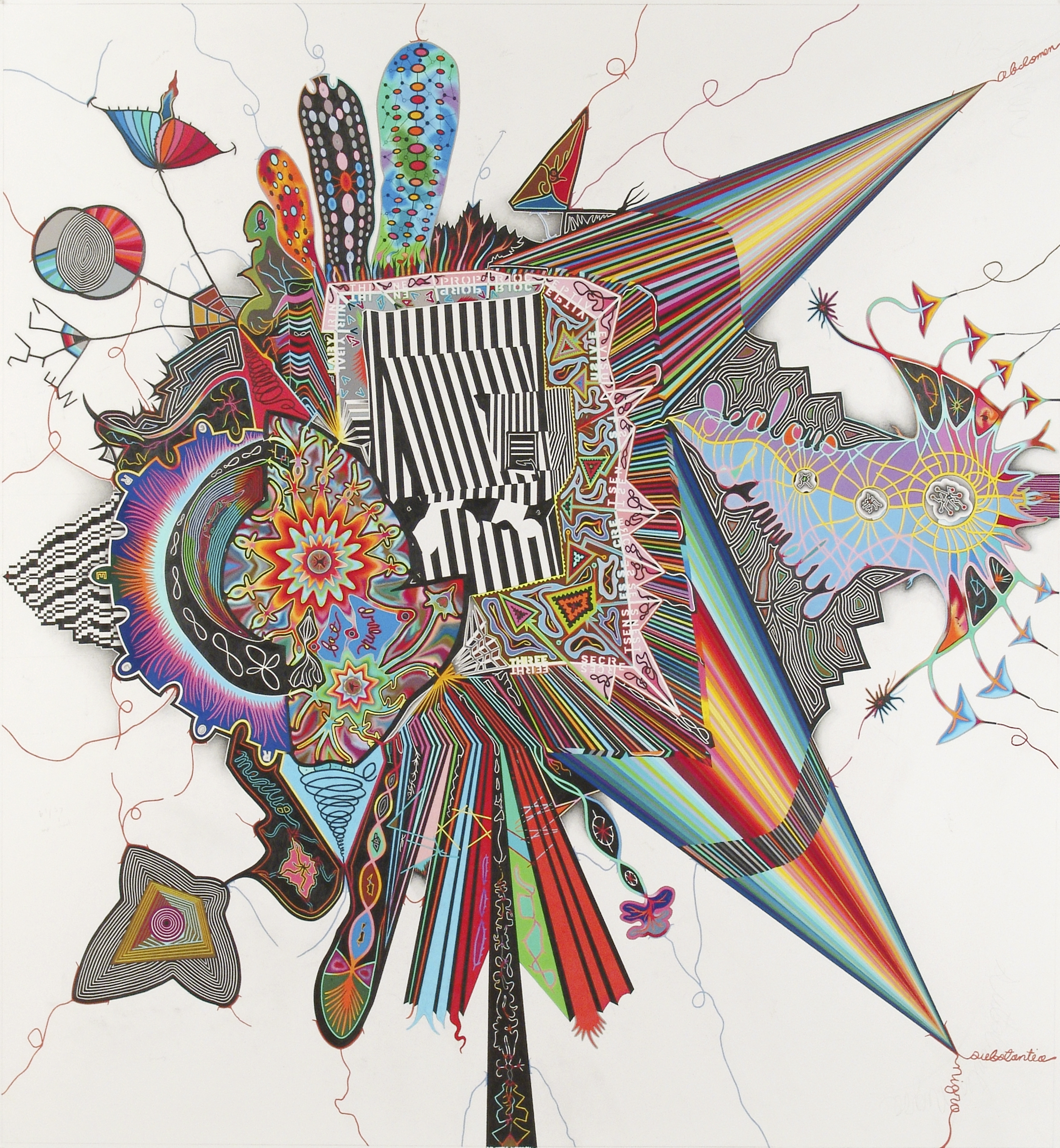
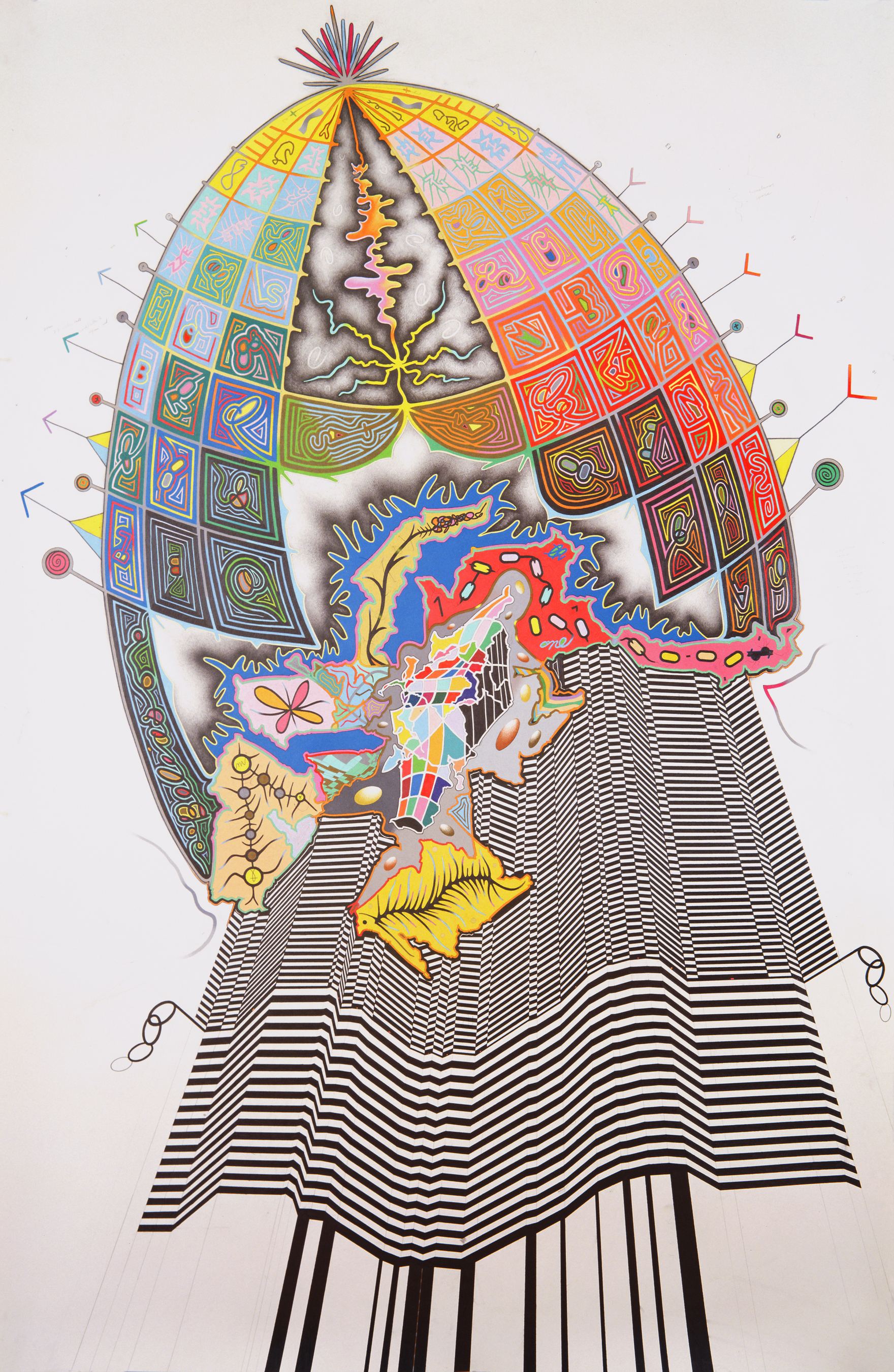
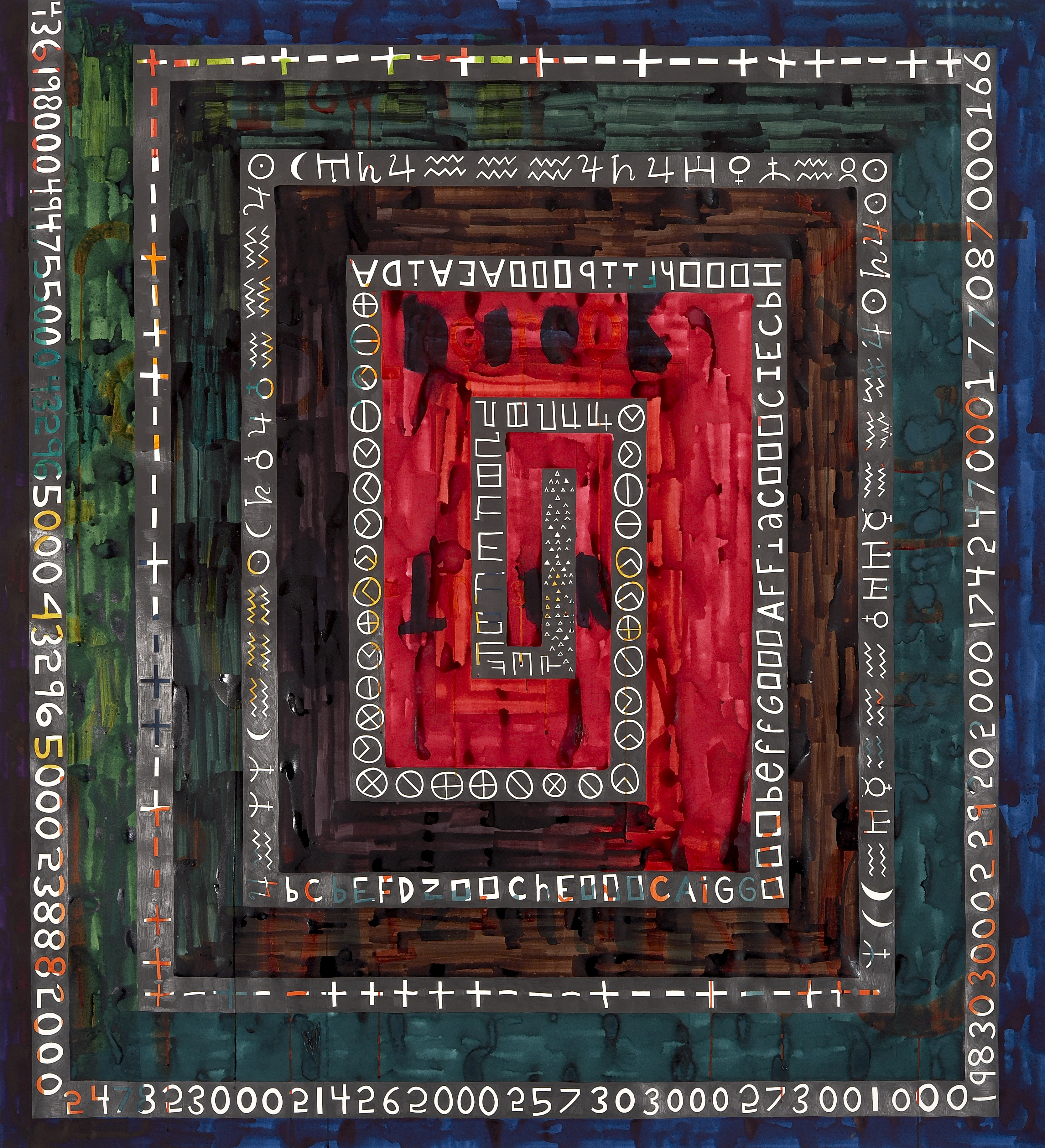
Recursevolution
72 × 68 inches, colored pencil, graphite, and gesso on paper
In Recursevolution, I investigated the recursive dynamic between the evolution of matter into life and the emergence of consciousness. The drawing mirrors cosmic processes of expansion and contraction, functioning as a microcosm of the universe’s own feedback loop. Biological evolution reflects the Big Bang - - an outward surge of complexity and awareness - - while artificial intelligence moves in reverse, folding inward toward embodiment and simulated understanding, parallel to the Big Crunch (hypothetical end of the universe).
Structured after the layered anatomy of the sun, the drawing traces evolutionary phases from the earliest chemical awareness to human cognition and the merging of biological and artificial minds. Across it, figures of incomplete consciousness (zombie, ghost, droid, and human represent the body without mind, the mind without body, and their unstable union. The work becomes both diagram and organism, my mediation on how matter perceives itself and how the universe, through order and entropy, witnesses both its birth and the inevitability of its death.
Full Description linked HERE
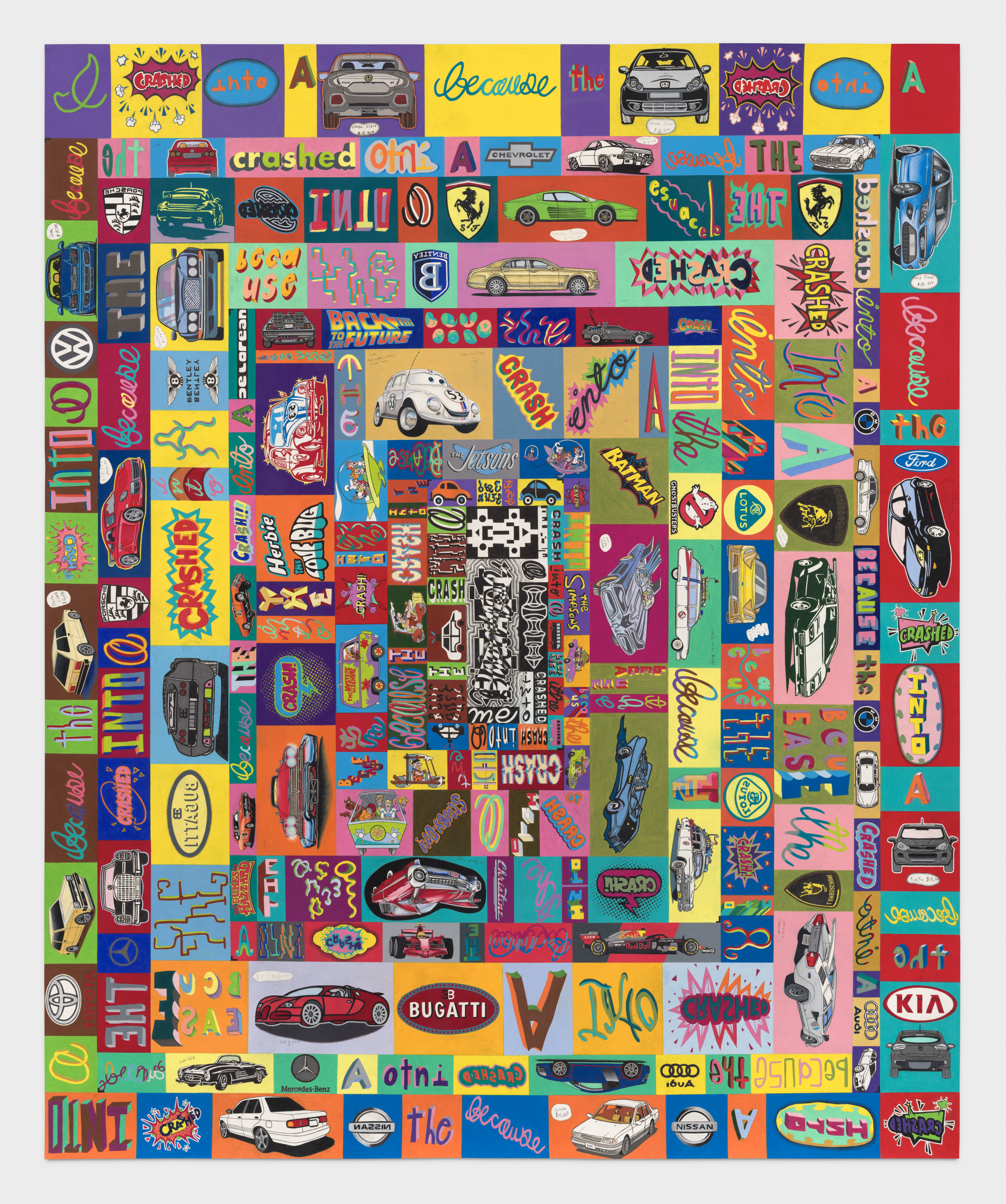
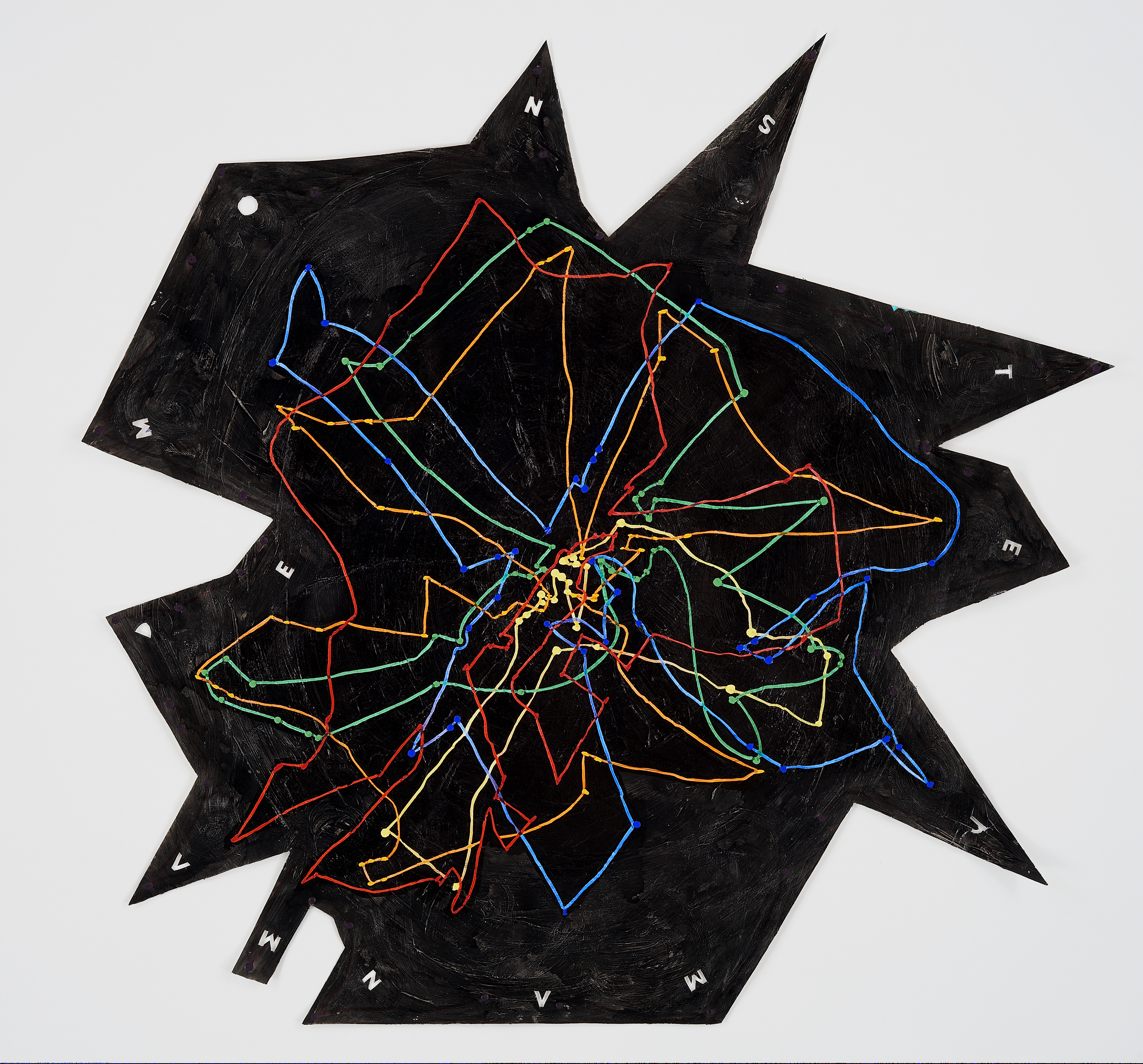
Car Crash
85 x 69.75 inches, colored pencil and graphite on paper
In a car crash chain, the physics (example of Newton’s Laws of Motion) involves rapid changes in momentum as kinetic energy from one car is transferred at impact to the next car, which then transfers energy to the following car, and so on. This creates a coiling effect that expands and contracts with each successive crash. I thought of this as analogous to the societal transfer of wealth from poor to rich. This process is evident in products and assets—vehicles—whose practical function is incrementally usurped by their form as luxury objects. As this process unfolds over time, it also seemed to me analogous to how a wormhole suggests passage through space-time.
This drawing “begins” at the top left with one of the least expensive cars in the U.S., a Honda Civic, which crashes into a more expensive car, and so on. The value of each successive car rises incrementally, eventually peaking with the most expensive luxury vehicle available for purchase, a Lotus. After this phase, cars from films and television shows crash into each other, followed by cartoon cars and fictional ones. In the center, the car as a purely visual form becomes an abstraction and is absorbed into a wormhole-like space, with colors that loop back to the starting point, perpetuating an endless car crash chain. The spiraling geometric bands that structure the drawing increase and decrease in scale proportionately as the drawing moves centripetally, while its ideas expand centrifugally. Each car changes direction to imply both transfer of energy and alternating point of view—as if we were in the crashing car, and simultaneously in the one being crashed into.
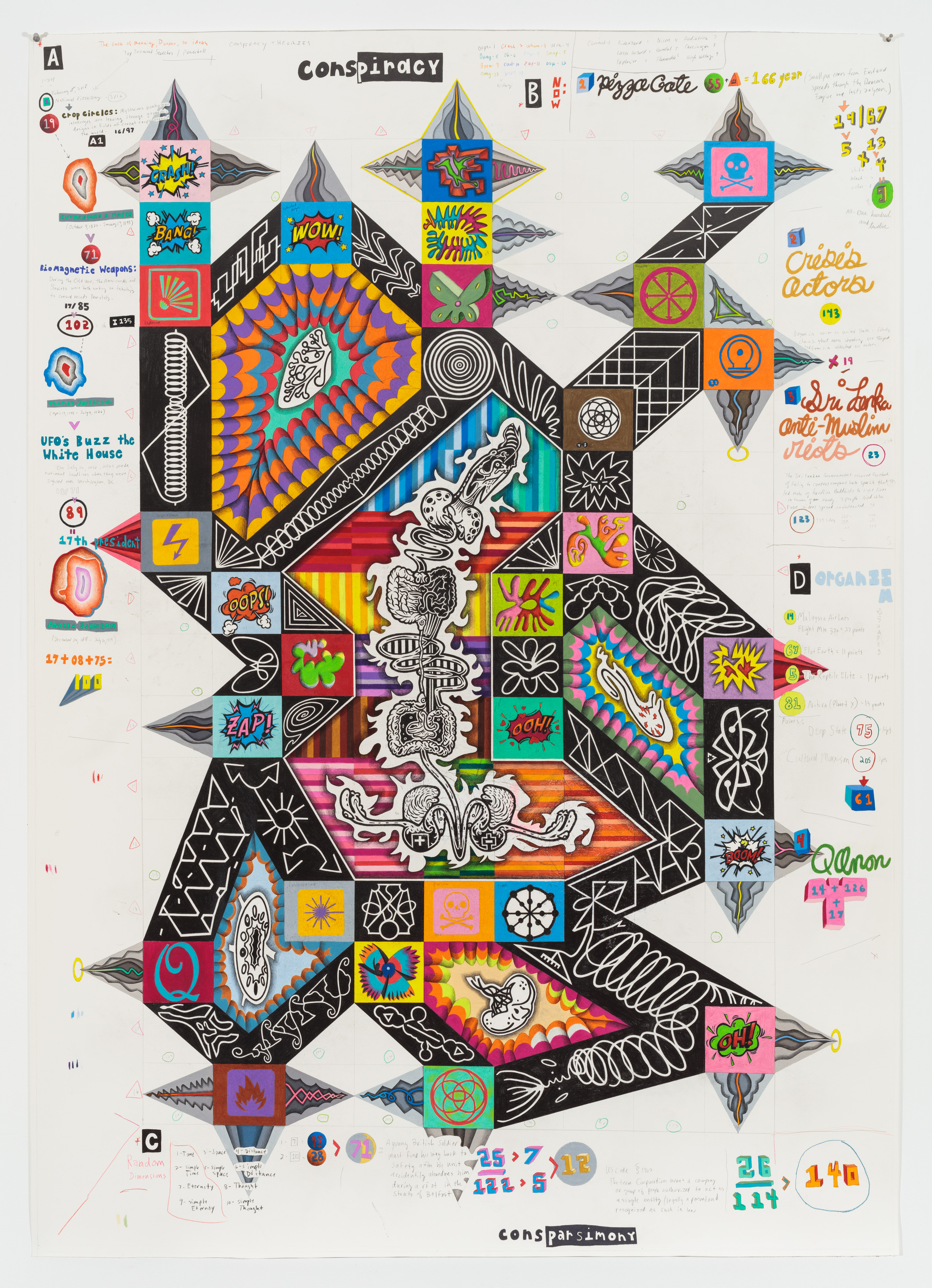
Conspiracy: Faker Sent INN
69.25 x 49.25 inches, colored pencil and graphite on paper
This drawing maps the cyclical processes by which false information (specifically vast conspiracy theories) is communicated in ways that cause people (sometimes ourselves) to believe they are true, and then to act on these beliefs, further reinforcing their seeming validity—from how we vote in an election, to how a Pizza Gate, Q-anon believer showed up at Comet Ping Pong with a gun.
In this drawing, I explored this phenomenon by first creating a large grid on the paper and numbering each square. I researched various conspiracy theories, both current and historical, mainstream and fringe, and wrote the key descriptive words associated with them on the drawing (from first-hand accounts by participants and early news stories describing their initial surfacings). I then converted these words into numbers using an alphabet code and linked them to a range of symbols, like cartoon explosion sounds and natural disaster warning signs. These cartoon sounds represented moments of epiphany or revelation—like if someone suddenly transforms from skeptic to believer. Around the drawing, I noted the total number of letters in each conspiracy theory and matched them to their corresponding numbers on the grid. I connected these theories on the grid and filled the connecting bands with white, mechanical structures set against flat, black graphite, building a structure resembling a physical body. Between the black bands, I drew human body parts like the spleen, heart, and brain in black and white. This language of conspiracy eventually formed a Frankenstein-like body. Our collective mind built a monstrous physical body.
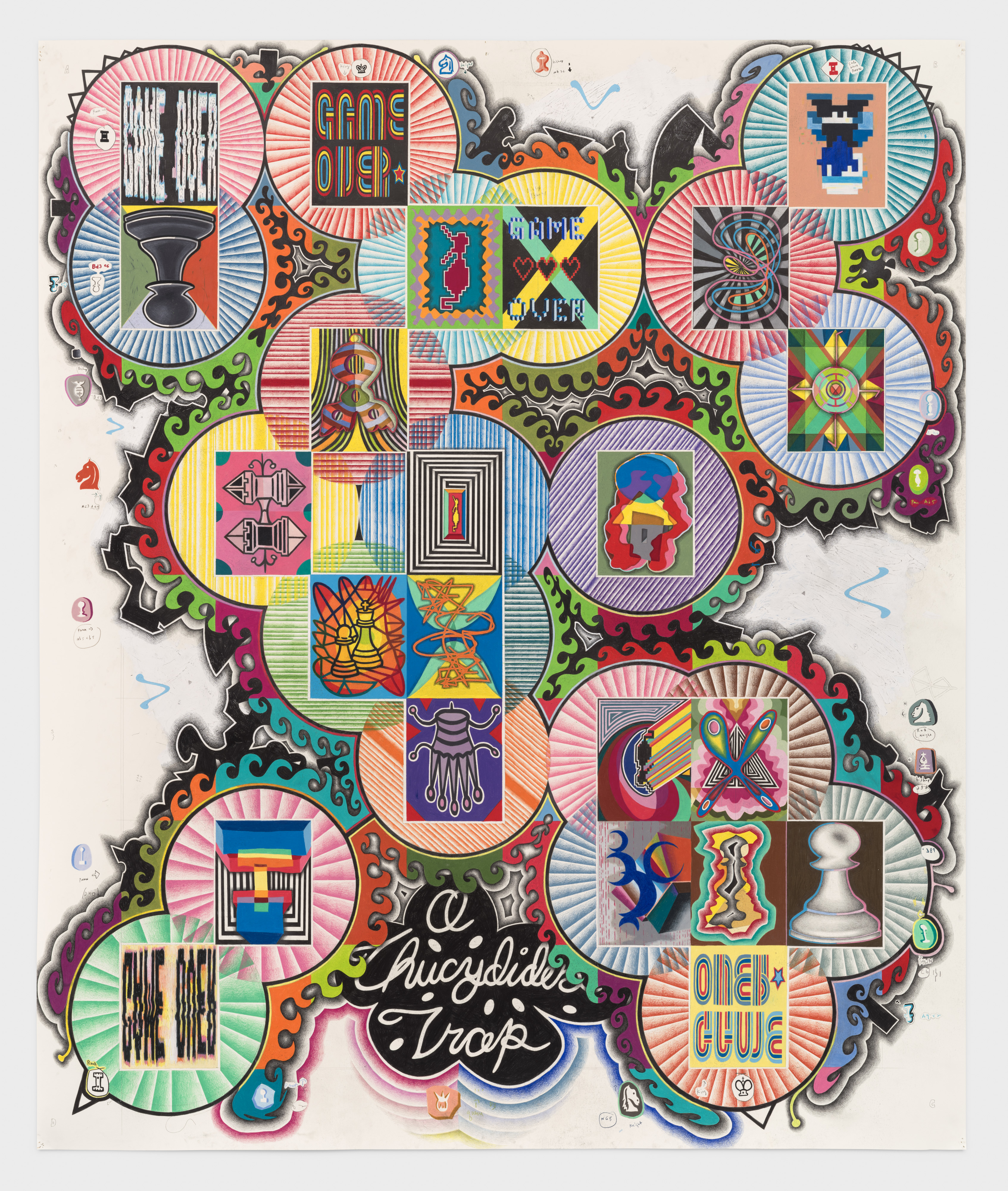
Zugzwang
81.5 x 67.75 inches, colored pencil, gesso, and graphite on paper
The structure of this work is derived from the chess positions in Game 6 between Garry Kasparov and IBM’s Deep Blue in 1997. This set of games is often viewed as a sea change moment when artificial intelligence asserted decisive dominance over human intellect.
The final position in this chess match, specifically after move 19, C4, marked a turning point. Analysis showed that at this stage, Kasparov had lost the game, though he did not recognize it. This moment seemed analogous to the concept of “Zugzwang” in chess, where a player is forced to make a move, often to their disadvantage. In this case, Kasparov had no possible move and was forced to resign.
To me, this particular moment within this specific game seemed equivalent to a Thucydides Trap, a military principle where an emerging force challenges and destabilizes an existing dominant power, causing disorientation and leading to the escalation of confrontation. The evolving patterns of this chess match contained evidence of the incremental transformation that was taking place, like a phase change, invisible to all but the AI: as each piece moved, the transition from human to machine dominance became clear but was not understood by the human being.

The Road
24 x 18 inches, colored pencil and graphite on paper mounted on panel
I began this piece with the punchline, “To get to the other side.” By starting with the answer rather than the question, I hoped to invert the logic of this famous joke to explore how meaning shifts incrementally and imperceptibly through repetition. The color patterns echo from top to bottom, creating a rhythm that mirrors the recursive structure of the text itself. I thought of the road as a metaphor for phase change, spaces where meaning transforms gradually through subtle variation and accumulation over time. The joke becomes less about humor and more about behavior, language, and iteration: how repetition creates change, how pattern becomes meaning. It’s similar to how listening to a song again and again alters how we feel about it, or how a story retold across generations evolves in tone and meaning. First printed in 1847, this joke continues to mutate; its language remains exactly the same, yet our interpretation shifts with each retelling, shaped by context and cultural change. By the time the original question reappears at the bottom, it is both the end and the beginning, a self-reflective loop where the joke contemplates its own evolution.

Consciousness of Consciousness
30 x 22.5 inches, colored pencil, gesso, graphite, and paint pen on paper
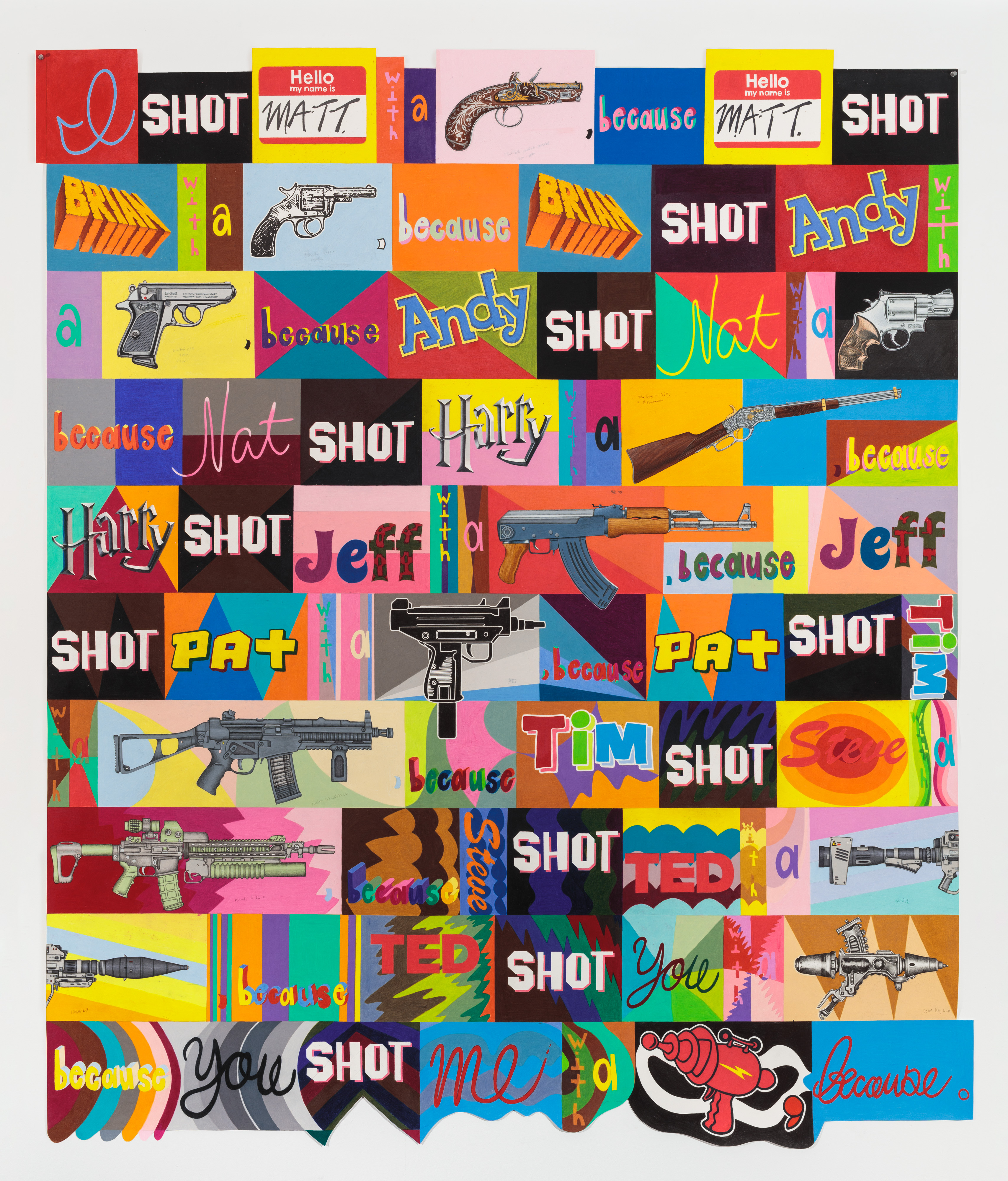
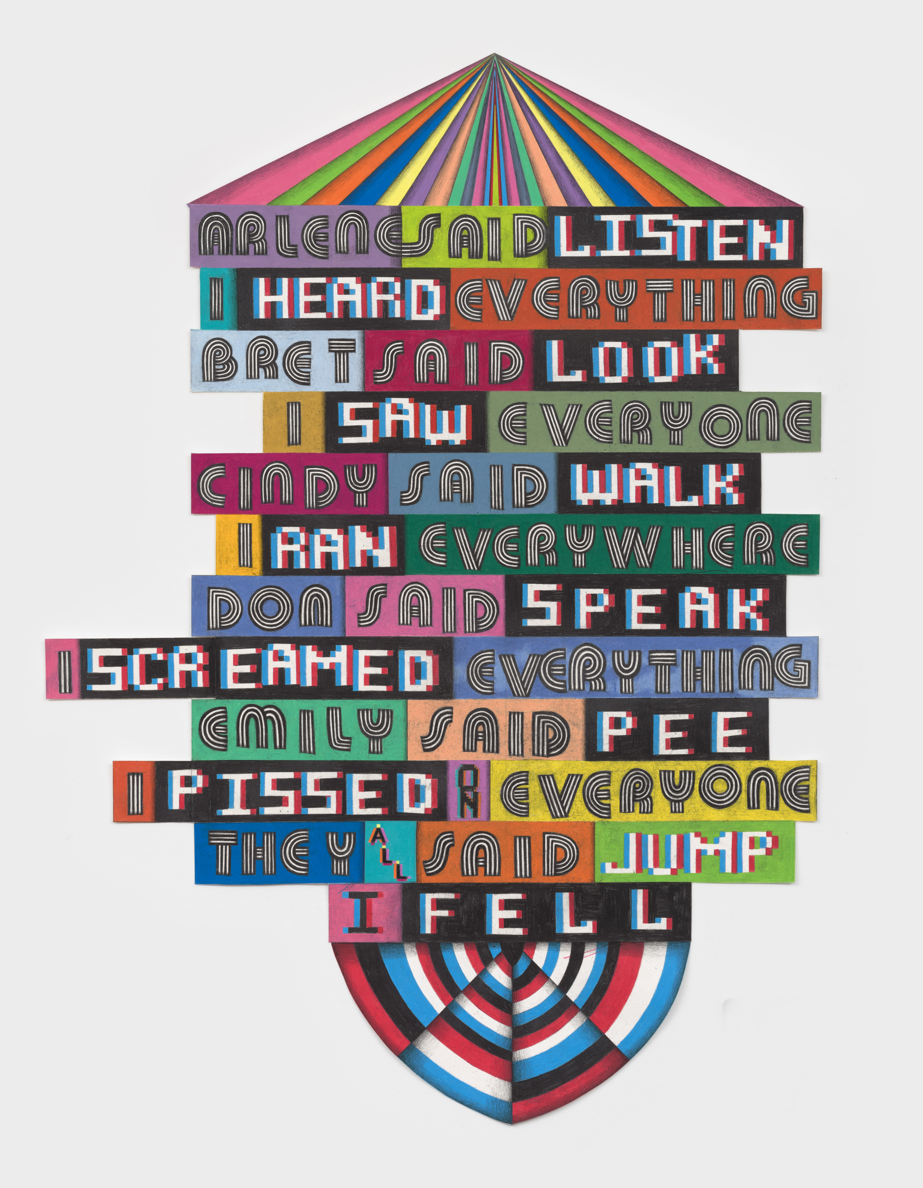
I Shot
82.25 x 70.25 inches, colored pencil and graphite on paper
The name of each person drawn is someone from my childhood. The guns progress from old and rudimentary at the top, to increasingly powerful and militarized in the center, and finally to fictional weapons at the bottom, drawn from a video game and a cartoon. The sequence functions like a timeline, stretching from the earliest firearms through modern warfare and into imagined futures, as if violence is embedded in history, carried within each physical weapon, and projected forward endlessly. The visual patterns grow more complex as the violence escalates, following the Fibonacci sequence, an exponentially expanding chaos. Shots multiply in predictable increments, alluding to a sense of inevitability, while the repeated word “because” exposes contingency: each act depends on the last. It is incremental, like the boiling frog, where escalation is absorbed until it becomes catastrophic. The final line loops back to the beginning, closing history’s circle as I implicate myself.
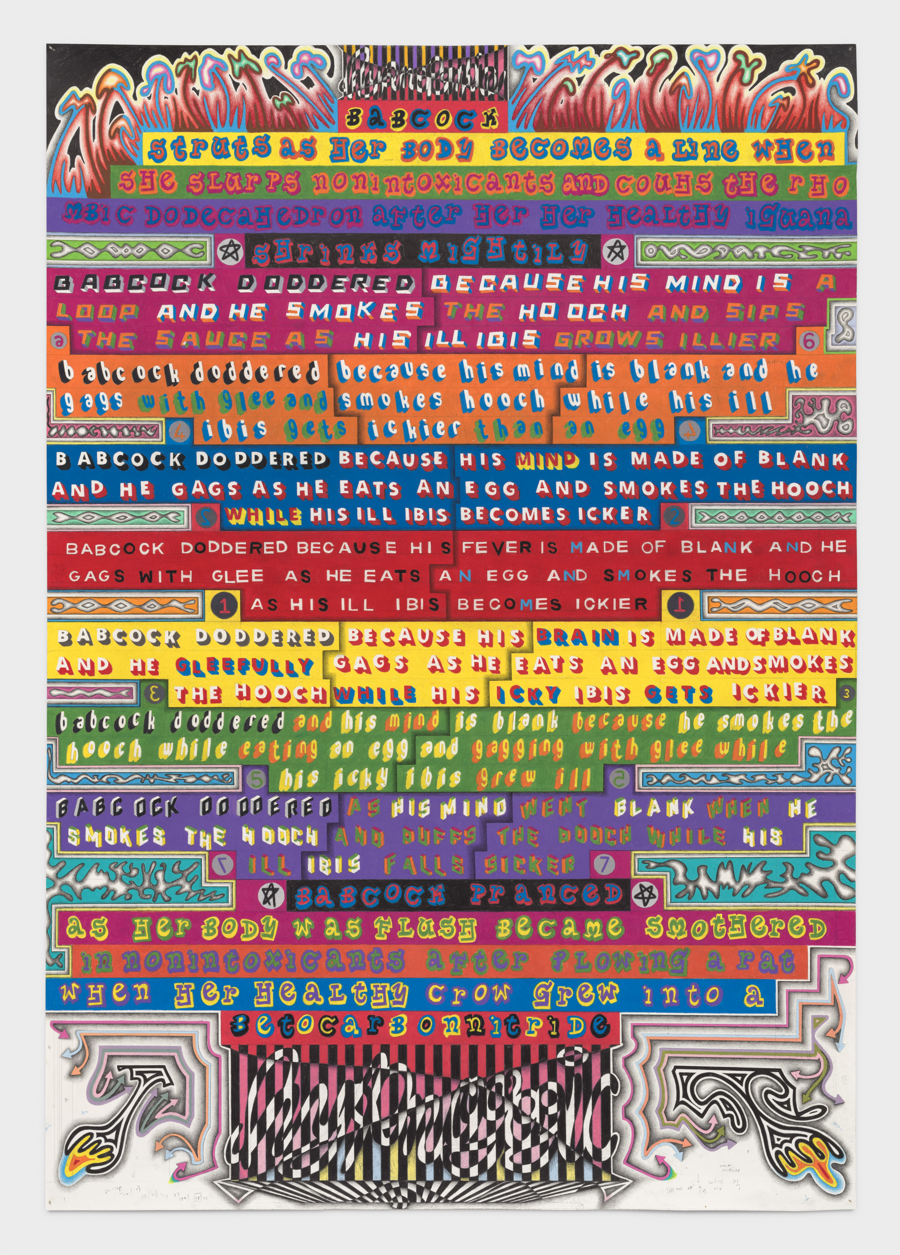
Babcock Doddered
56 x 32.25 inches, colored pencil and graphite on paper
I discovered a long line of text in my sketchbook from a few years ago. I had no recollection of having written it or of how I came up with the language. This was a strange phenomenon—not remembering something that I had conceived. It sounded so specific. I decided to make a drawing about this experience. I began by writing the text that began with “Babcock doddered…” in the center of the drawing, using the Snellen eye chart font. For several days after that, just before falling asleep and as soon as I woke up in the morning, I tried to remember the modified text. I drew these similar but mis-remembered texts above and below the original. Then, the next night I tried to recall this altered sentence and in the morning I tried to remember that modified text. I was trying to engage the mental states of hypnagogia (the moment when you transition from wakefulness to sleep) and hypnopompia (the moment moving from sleep to wakefulness) as a means of visualizing memory of narrative language. In each state, disorientation occurs and memory is affected by various stimuli. The language of this drawing gives form to these transitional states of consciousness, as well as the dissolution of memory through repetition over time.
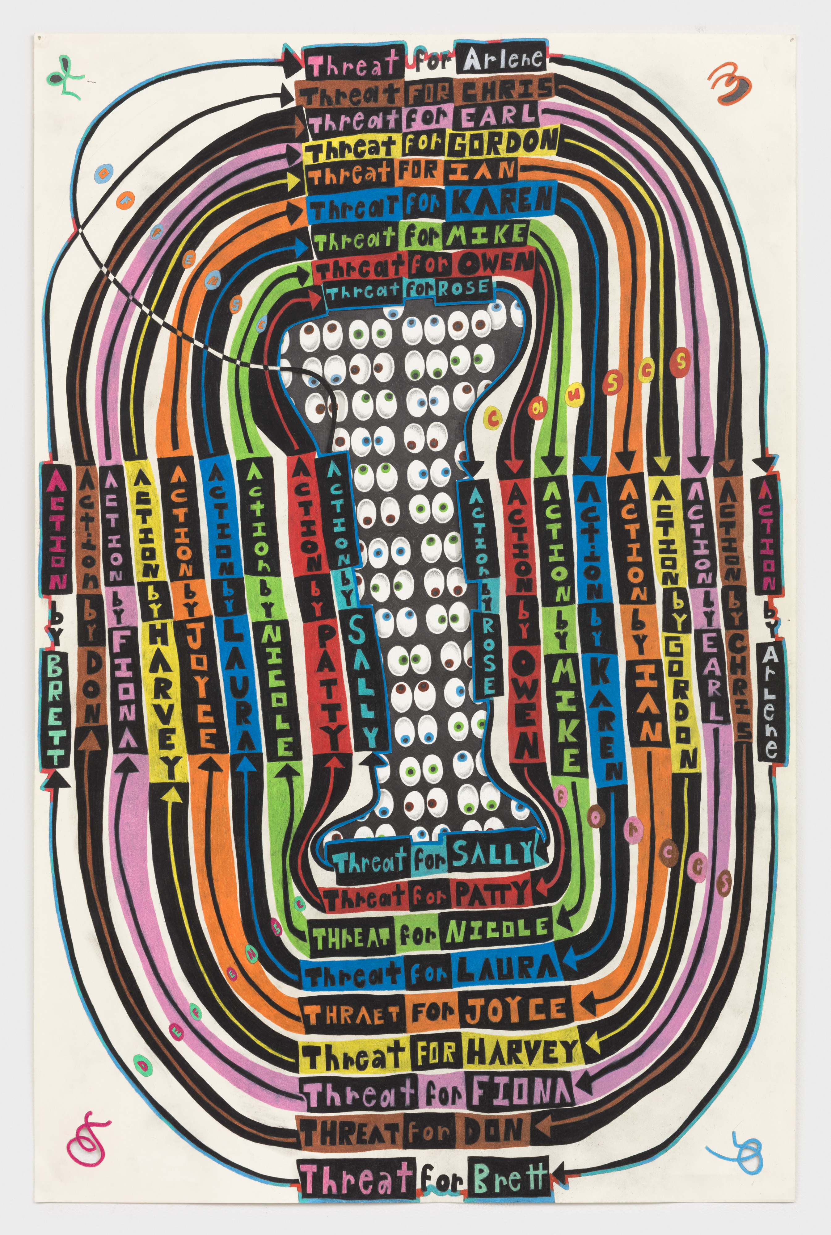
Together
40 x 26 inches, Graphite and colored pencil on cut and layered paper
A sequence of threats and reactions forms an endless loop. The names are derived alphabetically from hurricane nomenclature. The concept is loosely based on Friedrich Glasl's model of conflict escalation. The drawing examines how amplification occurs through repetition: threats turn into reactions, which then become actions, and these actions subsequently transform back into threats, perpetuating the cycle.
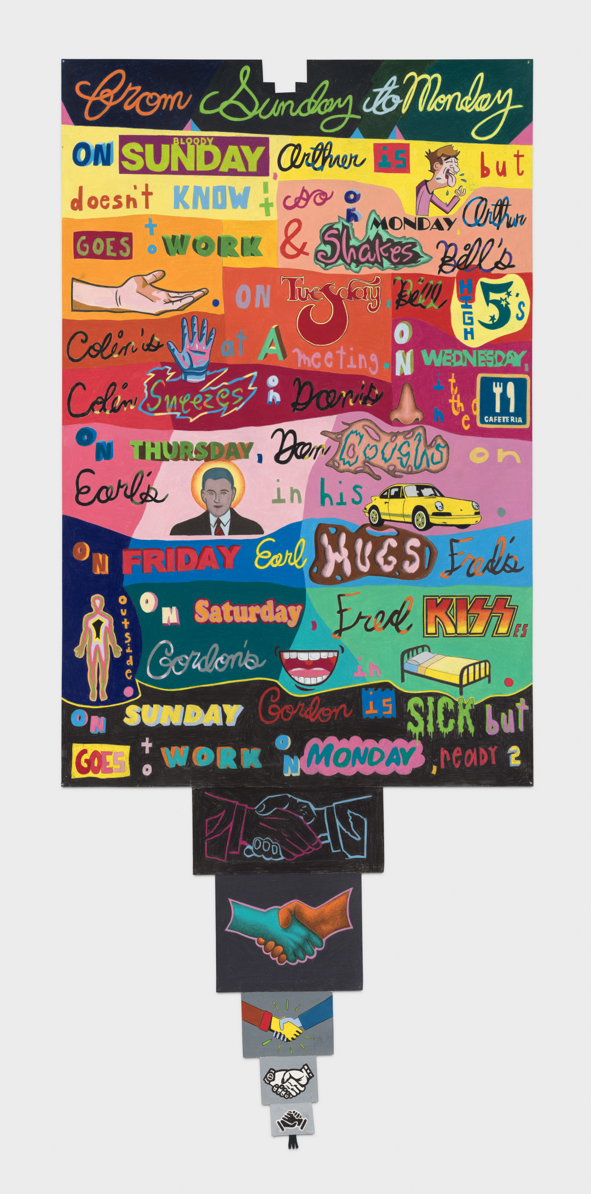
Earl Seems to be Involved with Hugs
59.75 x 25.75 inches, Graphite and colored pencil on shaped paper
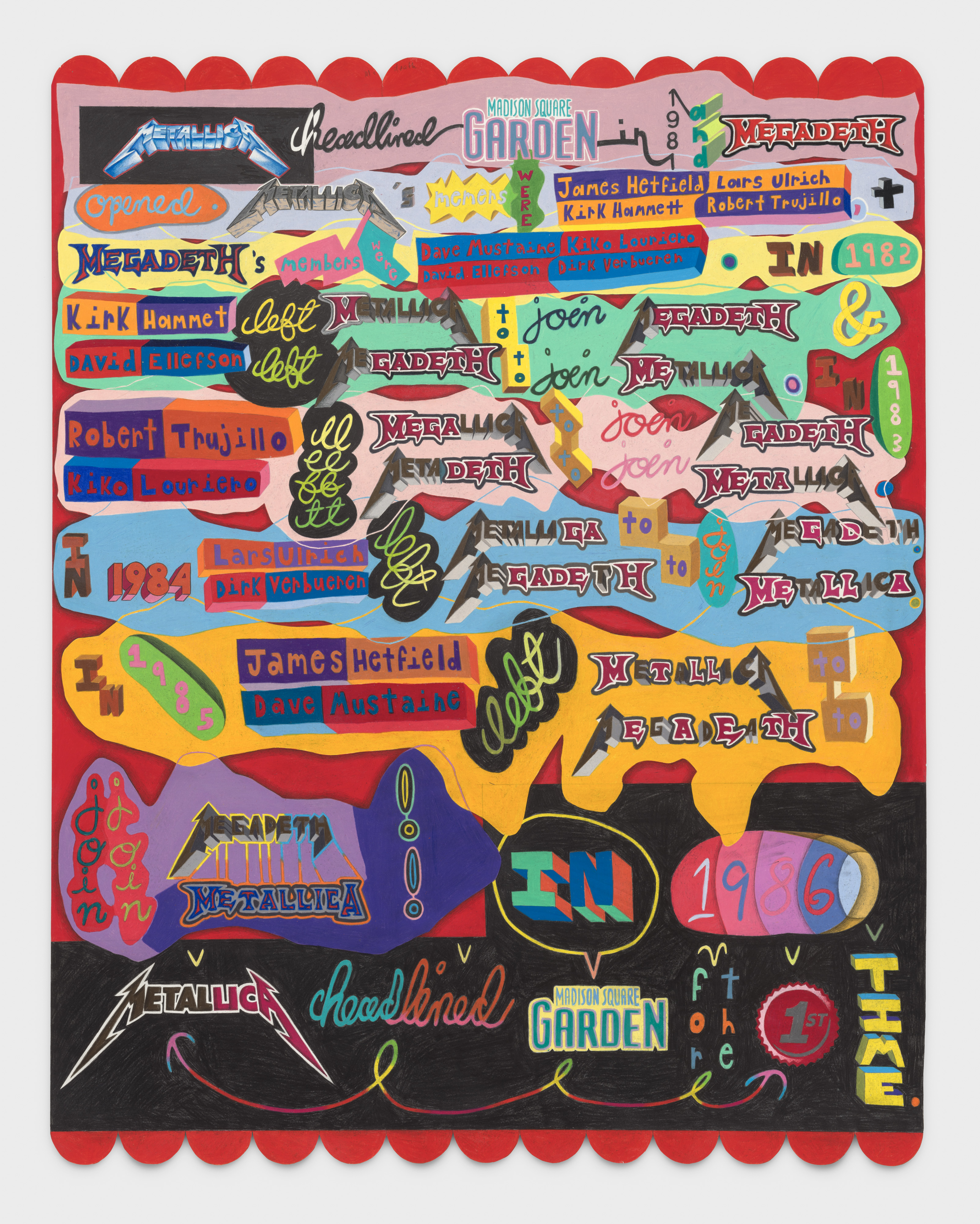
Ship of Theseus
46 x 36.25 inches, Graphite and colored pencil on shaped paper
“The ship wherein Theseus and the youth of Athens returned from Crete had thirty oars and was preserved by the Athenians down even to the time of Demetrius Phalereus. They took away the old planks as they decayed, putting in new and stronger timber in their places, insomuch that this ship became a standing example among the philosophers, for the logical question of things that grow; one side holding that the ship remained the same, and the other contending that it was not the same.” — Plutarch, Life of Theseus 23.1
This drawing is based on the above paradox. It's a thought experiment in philosophy that explores the nature of identity through incremental transformation and has implications in the philosophy of the self, consciousness, the ontology of identity, and the relationship between language and truth. Its central question is: if an object has had all its components replaced, does it remain fundamentally the same object, or does it become a new thing entirely?
In the case of my drawing, if the members of two bands gradually trade places over time, do the bands themselves remain the same? Or has Metallica essentially become Megadeth, and vice versa?
The Go Getter
34.75 x 25.3 inches, Graphite and colored pencil on shaped paper
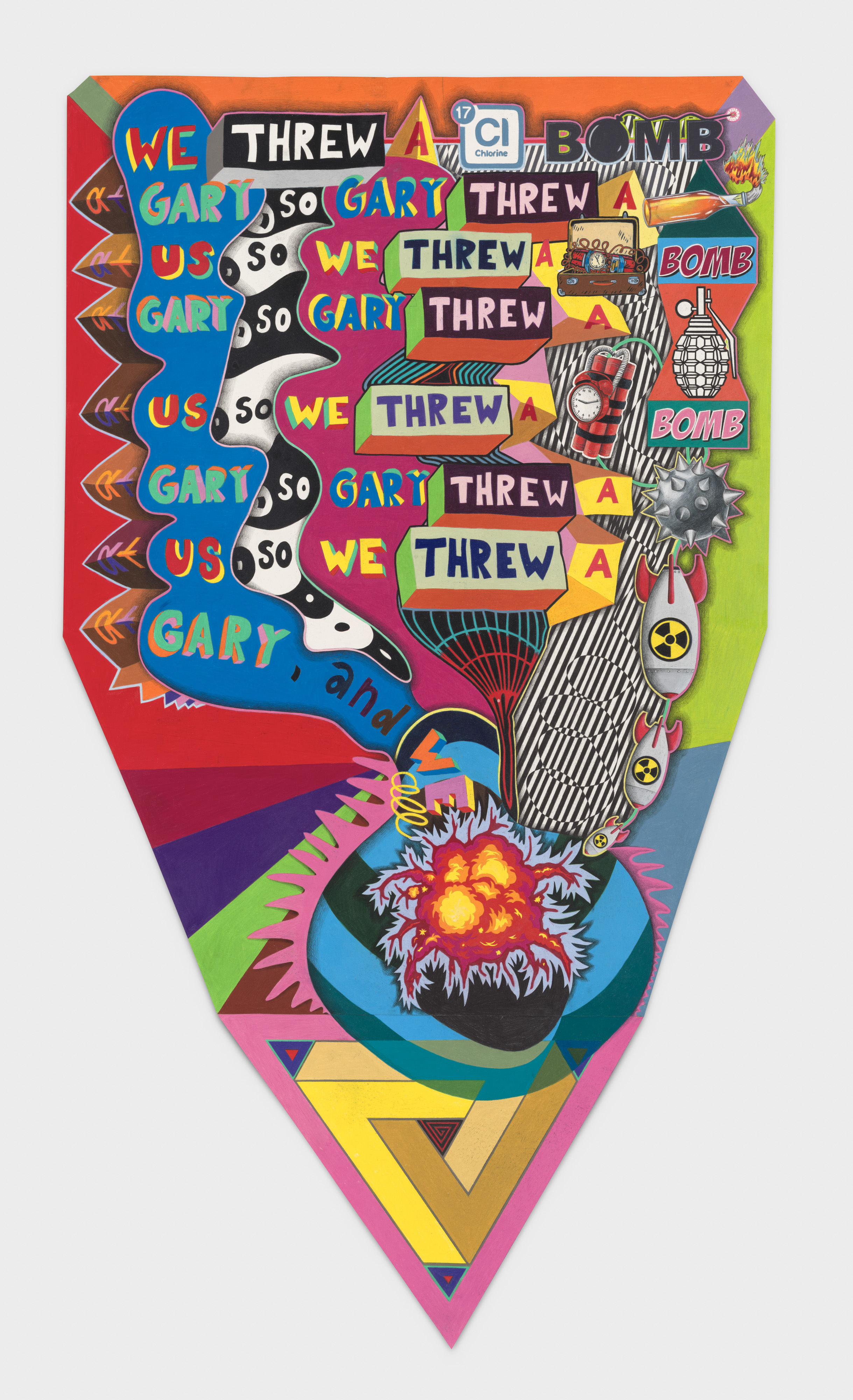
We Threw a Bomb at Gary
62.5 x 36 inches, Graphite and colored pencil on shaped paper
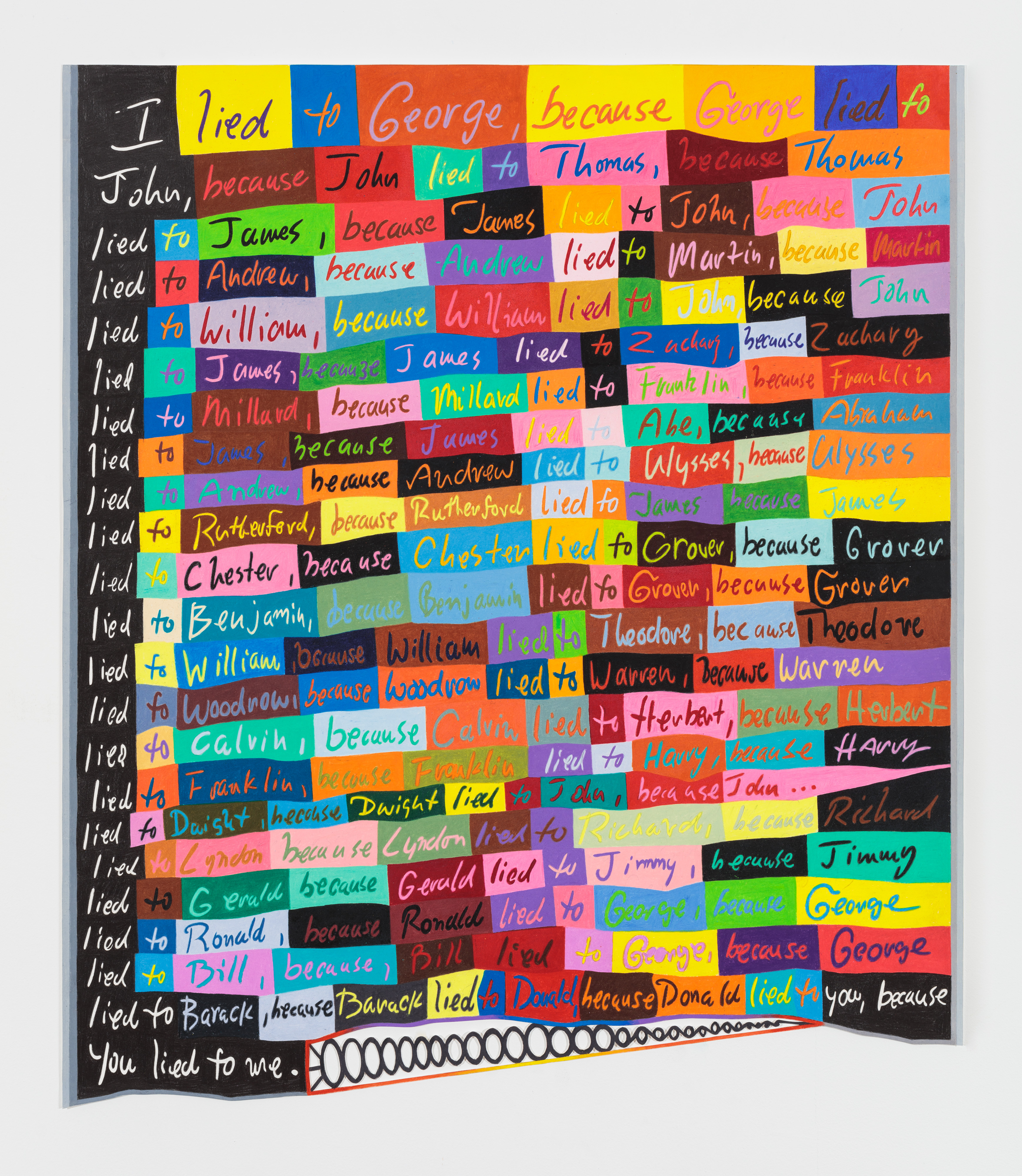
I, Lied
35.25 x 30.25 inches, Graphite and colored pencil on cut and shaped paper
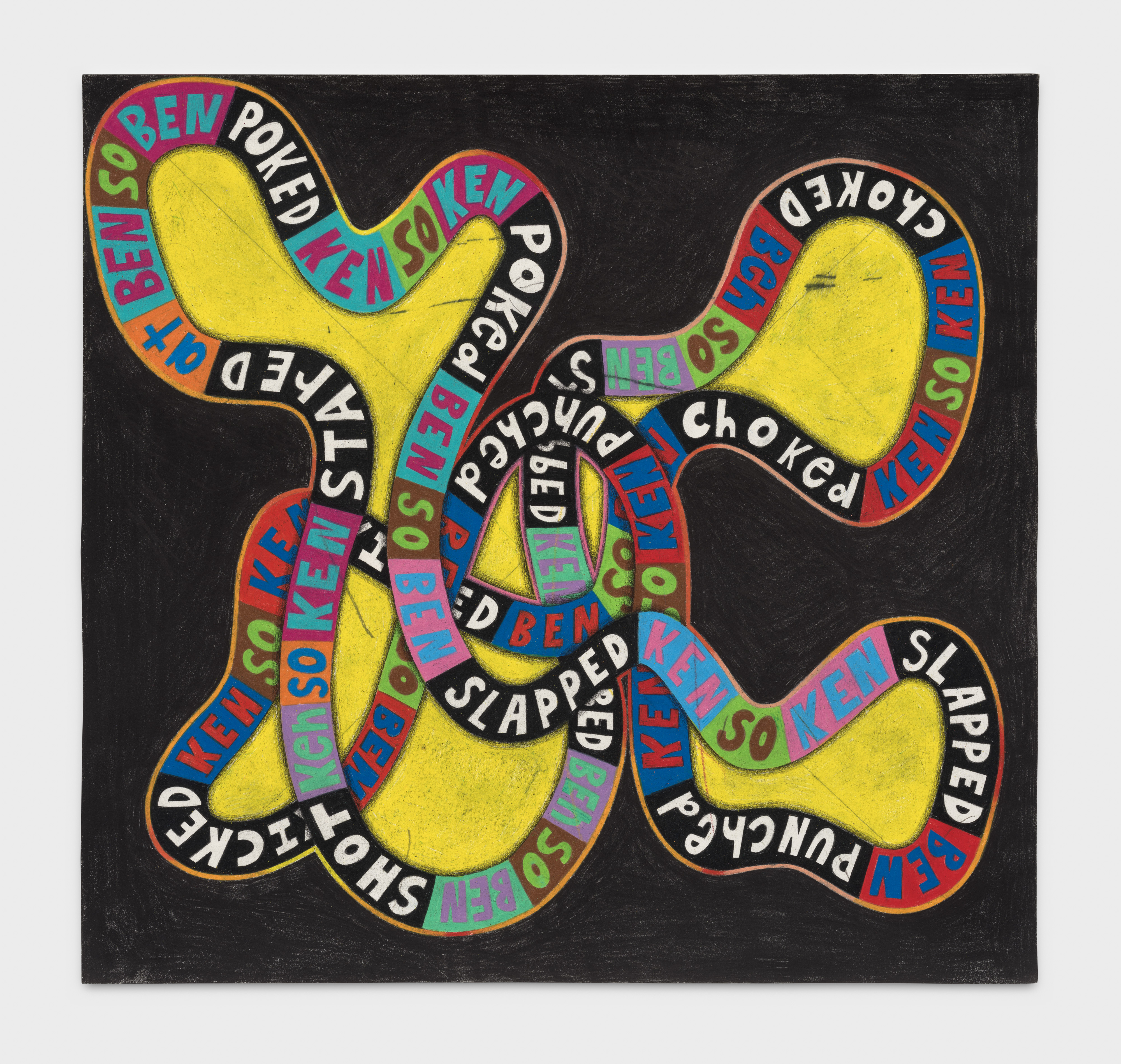
Ben><Ken
21 x 22 inches, Graphite and colored pencil on paper
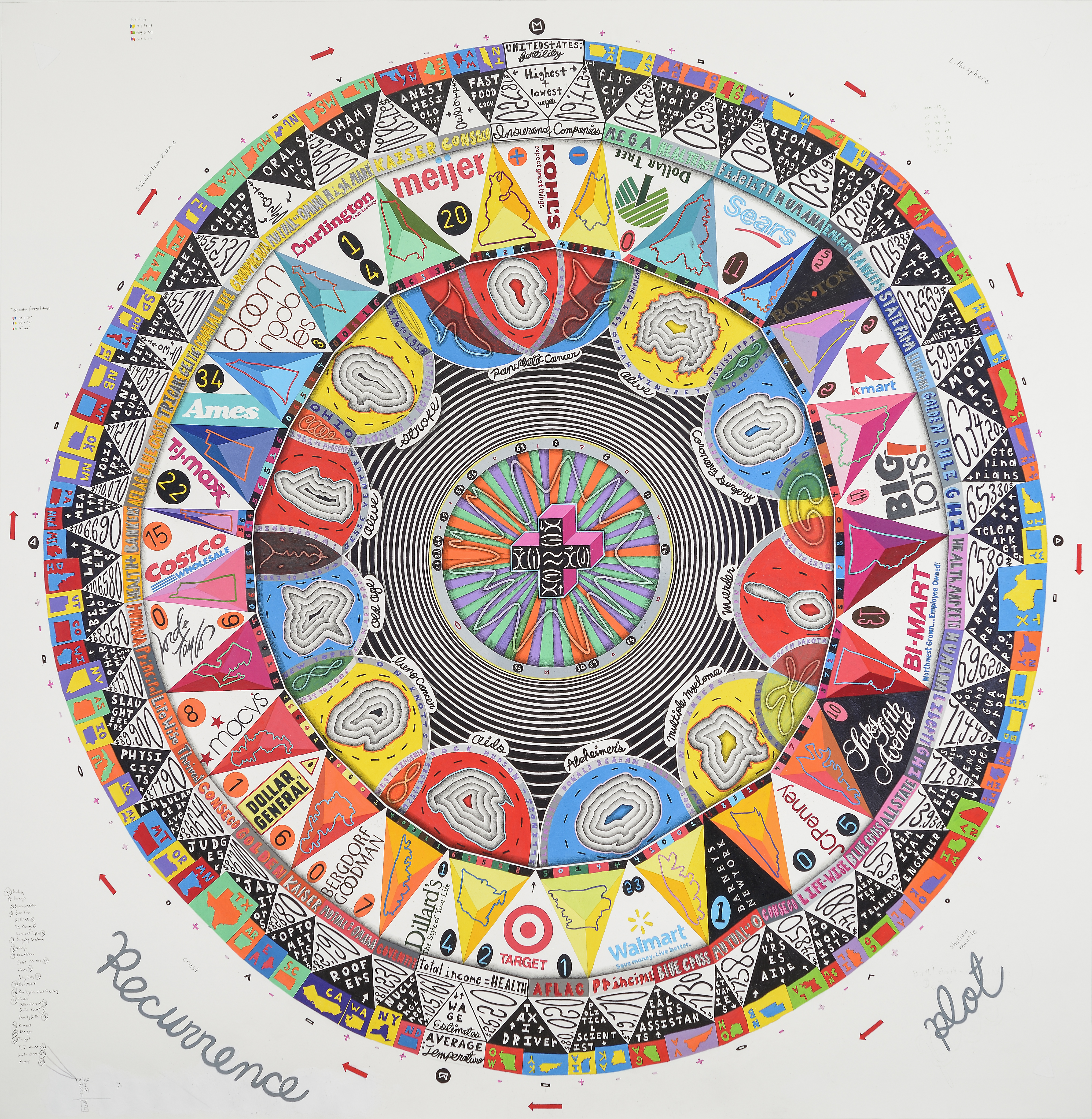
A Recurrence Plot
68 x 56 inches, acrylic, colored pencil and graphite on paper
I superimposed my ideas about Social Class onto the physical layers of Earth. I used the information from each layer, from crust through to core, to generate the subsequent layer’s information / form. I saw this as a lifecycle of sorts, from birth to death, infinitely repeated. CRUST: Fertility Rates and Average Yearly Temperature for each US state, color-coded LITHOSPHERE : Average salaries for highest and lowest paid professions, paired SUBDUCTION ZONE: Insurance Companies. I subtracted the previous salary amounts from each other and used this composite amount to determine a company MIDOCEAN RIDGES: Department Stores in US, ranging from high end to discount SHALLOW MANTLE: Shape of a US State / zip code of specific city – represents the geographic midpoint between the paired corporate headquarters TRANSITION REGION: Portrait of famous resident from the previous state LOWER MANTLE: Cause of death for each celebrity D LAYER : Optical ring transition OUTER CORE: Chance derived, star-like shape and colored bar pattern INNER CORE: Recurrence Plot Graph (in chaos theory, is a plot showing for a given moment in time, the times at which a phase space trajectory visits roughly the same area)
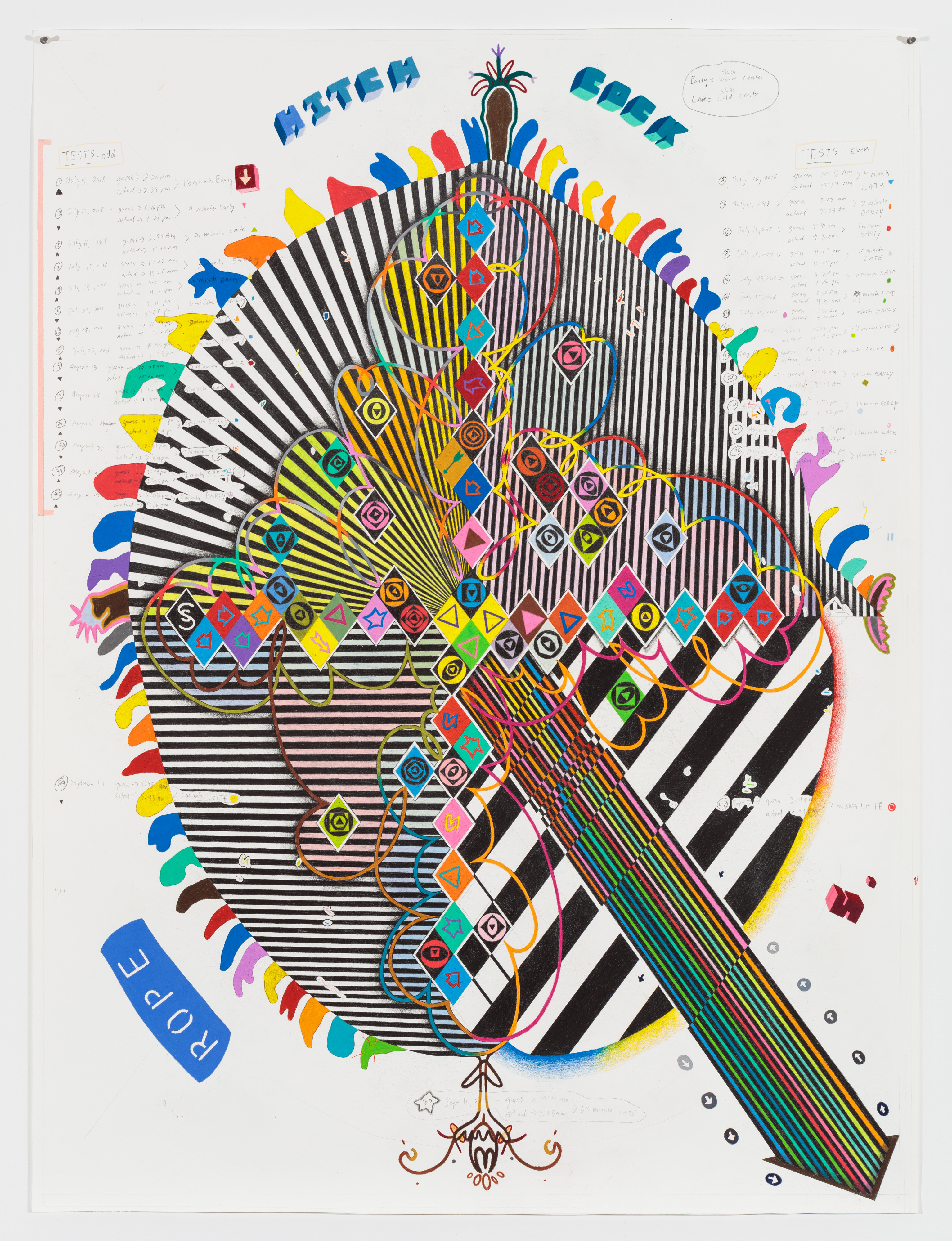
Hitchcock’s Rope
48.75 x 36.75 inches, colored pencil and graphite on paper
In this drawing, I explore my personal sense of time and its relation to 'real' time, inspired by how Hitchcock manipulates perceptions of time in his film Rope. In the movie, the skyline light fades more quickly than in real life, but as viewers, we perceive the onset of night as occurring in real time. Consequently, we experience time as passing more slowly than it actually does in the film. The concept of 'mind time' has always fascinated me—how we intuitively wake up, unconsciously interpret visual stimuli as temporal context, and how the physical world influences our sense of time.
For this drawing, I decided to test my own perceptions of time: Over several weeks, at various points, I attempted to guess the correct time. I then recorded this guess in the drawing and compared it to the actual time shown on my studio clock. I used the discrepancy—the 'time error'—to mark points on a grid I had drawn over much of the paper. Minutes off from the real time were translated into spaces between colored diamonds. My timed guesses and the resulting differences are noted around the drawing. If my guess was before or after the actual time, I created a pattern on the grid (the concentric circles and shapes) in either a warm or cool color. I continued this process in a clockwise motion from the center outward, until the shapes began to intersect with the noted times. Then, I connected these patterns and further developed the form. The movements of the external shapes and arrows are counterclockwise. The entire piece is a time machine, rooted in my temporal fallibility.
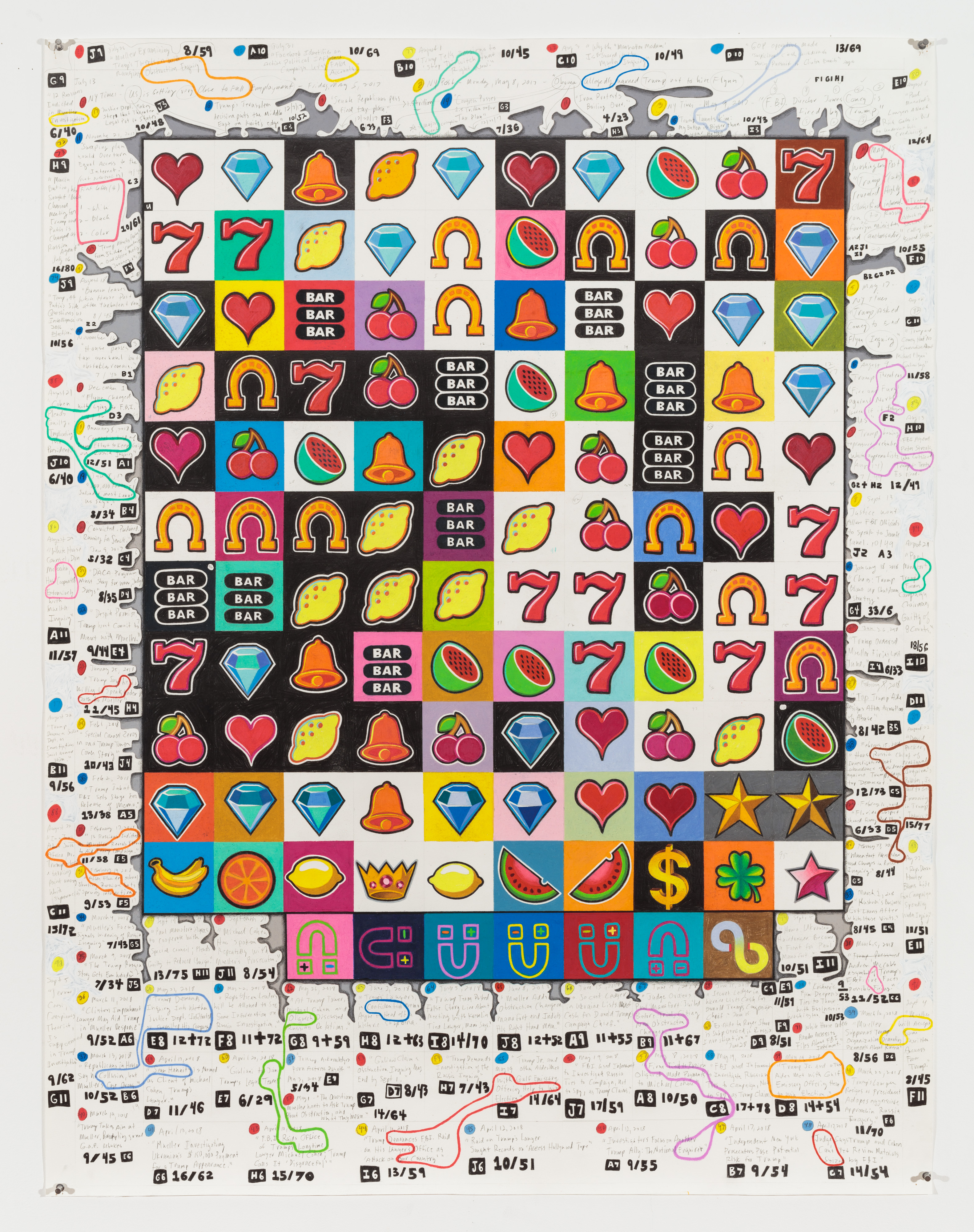
Slot Machine Politics
49.7 x 38.25 inches, colored pencil and graphite on paper
I began this drawing following the 2016 Presidential election to explore the complex relationship between political corruption and its coverage in the news. I likened this to playing a slot machine in a casino—patterns emerge over time, driven by forces unseen, and eventually, hopefully, a significant discovery uncovers hidden patterns, providing both a payoff and a psychological thrill. However, the drawing demonstrates that the "game" continues in recurrence, as what was revealed becomes obfuscated by new media narratives — the process of nefarious action devolving into entertainment and storytelling.
In terms of process, each day I recorded a headline from a major newspaper relevant to the Mueller Inquiry, as the retrospective examination of Trump’s political motives was distilled into the format of the news headline. I was interested in the relationship between linguistic patterns and behavioral ones. As the investigation progressed the drawing developed in tandem.
I converted each news headline into three numerical sets: total number of words, total number of letters, and the combined total of vowels and consonants. I then matched this data to a series of lottery icons, and drew the resulting images in a grid from top to bottom. The background colors were determined by even/odd outcome totals.
As the Mueller inquiry unfolded and news outlets attempted to give form the story as it developed (sometimes factual, other times speculative), my drawing tracked the precarious endeavor wherever it went, searching for meaning within the chaos.
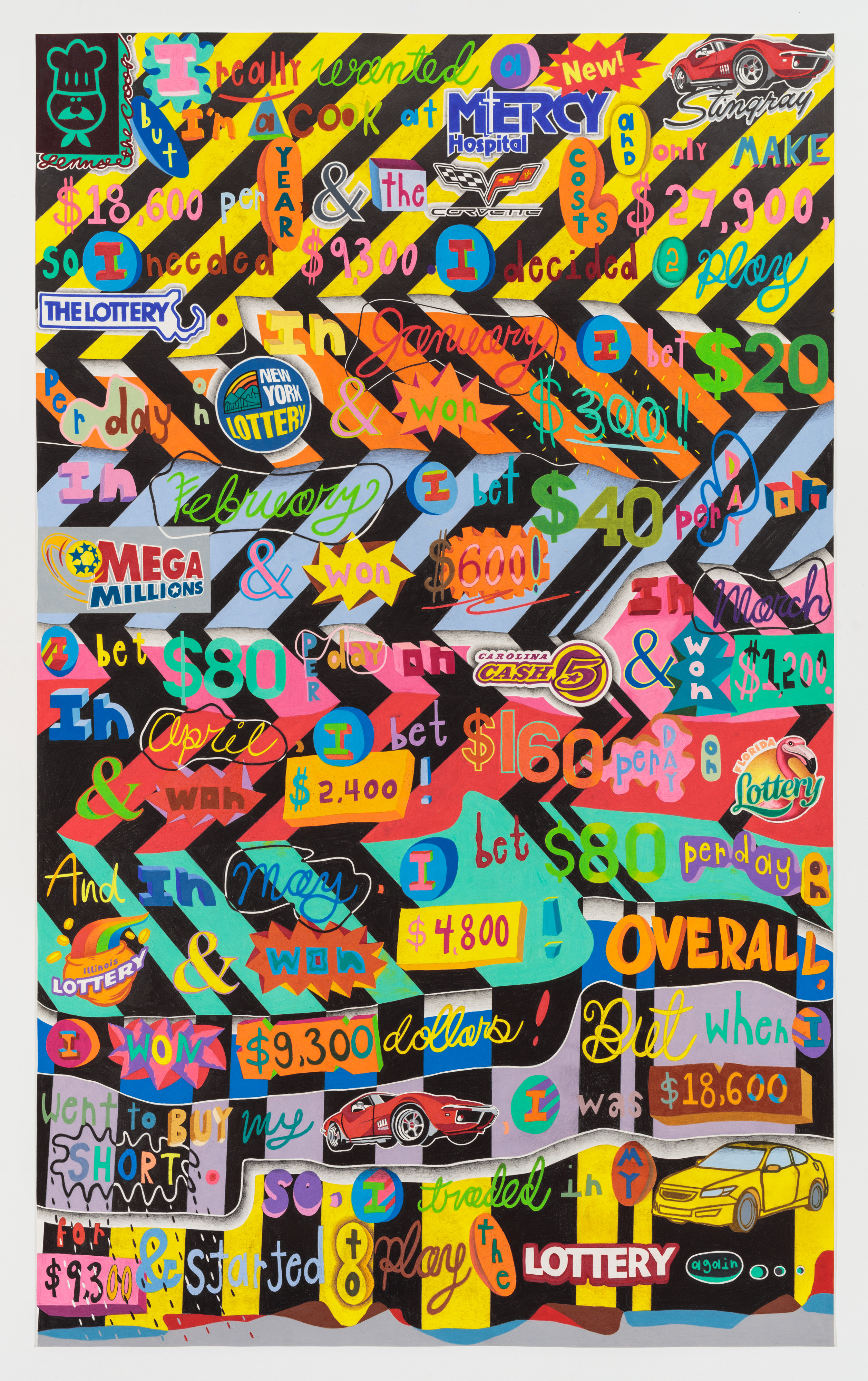
Lenny
65 x 39.5 inches, colored pencil and graphite on paper
This drawing is an offshoot of the Butterfly works. Lenny was a character in one – the kitchen boss in a hospital. I actually knew a Lenny, who was my real-life boss at the Noble Hospital kitchen in Westfield, MA. He always played the lottery. In this drawing I was interested in the ways in which kids learn about how society operates through word-based math problems. My son, who is 9 years old, often brings home these types of problems, which are really convoluted and stretch their narratives to fit the mathematical problems being studied. Because of this, the problem’s stories are often based in everyday life but are very elaborately concocted. In addition, these math problems presume a form of moral behavior based of fairness and equality, usually through the capitalist exchange of money and goods. PROCESS: With this framework in mind, I decided to make my own math problem based on a working-class person’s desire / need to purchase a symbol of the higher class. As Lenny attempts to play the lottery and put his winnings towards the purchase of a new Corvette, his less apparent losses accumulate to negate these winnings. In the end, Lenny is at the same place where he started – his labor was fruitless and overall class stagnation clear. A zero-sum game. Visually, I wanted to pattern to vibrate like a lottery ticket might and to push and pull you optically. Each lottery logo is from different state, which, if connected, would form a map of states associated with the perils of the lottery as a means of class suppression. I think it’s funny but also sad - like tragic humor.

The John Problem
36.5 x 37.25 inches, colored pencil and graphite on shaped and collaged paper
This drawing is based on The Conjunction Fallacy, otherwise known as The Linda Problem. The fallacy was first articulated by Amos Tversky and Daniel Kahneman, cognitive psychologists who explored human decision-making. The fallacy highlights how we perceive meaning where there most likely isn’t any. The original study question is here: Linda is thirty-one years old, single, outspoken, and very bright. She majored in philosophy. As a student, she was deeply concerned with issues of discrimination and social justice and also participated in anti-nuclear demonstrations. Which is more probable?
1. Linda is a bank teller.
2. Linda is a bank teller and is active in the feminist movement.
For this drawing, I formulated my own interpretation of the fallacy's premise, which both subverts the original question and references broader considerations about how we make consequential decisions when confronted with questions of meaning and significance.
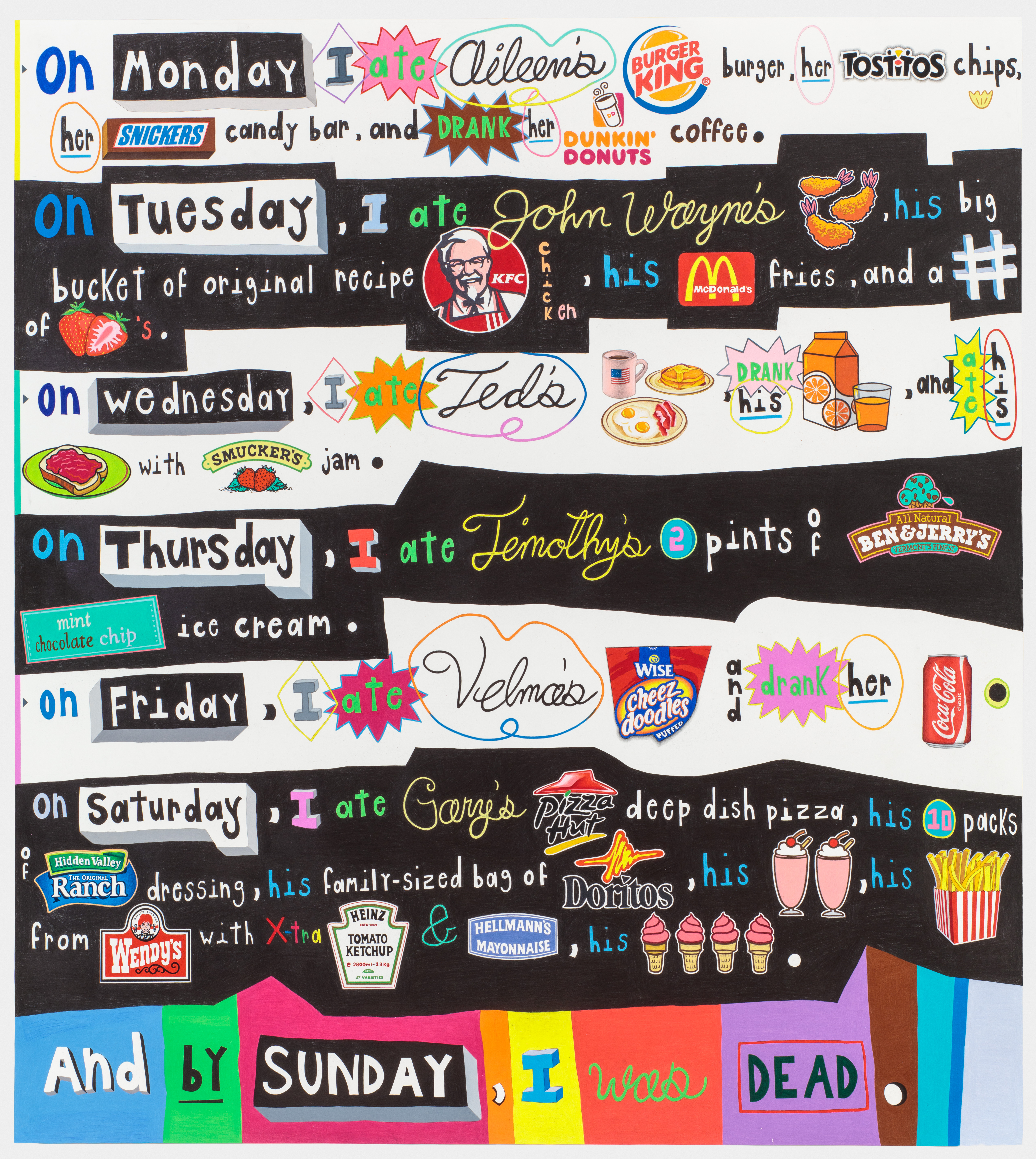
Last Meal
78 x 68 inches, colored pencil and graphite on paper
Drawing depicting an individual's consumption of 6 serial killer's last meals. Some of my notes are below. 1. Aileen Wuornos: serial killer; executed in Florida in 2002 – lethal injection 2. John Wayne Gacy: Serial murderer; executed in Illinois in 1994 – lethal injection 3. Ted Bundy: Serial killer; executed in Florida in 1989 – electrocution 4. Timothy McVeigh: domestic terrorist/mass murder; executed in Oklahoma, in 2001 – lethal injection 5. Velma Barfield: murder, executed in North Carolina in 1984 – lethal injection 6. Gary Carl Simmons, Jr.: 1996 murderer; executed in Mississippi in 2012 – Lethal injection I thought of the meals as a recipe list or diet plan, ending with the same fate as the killers. I also thought that the foods are so specific and common that it's a way for us to connect to them as human beings... funny and sad, very tragic, actually. They were also influenced by advertising and junk food's chemical effects. That brought the idea of nature vs. nurture to mind for me... could any of us have ended up like them depending on chance (where we were born, how we were brought up, who influenced our thinking, etc.)? That's part of the reason that I alternated black and white... positive and negative.
Indeflation
26 x 27 inches, colored pencil and graphite on paper
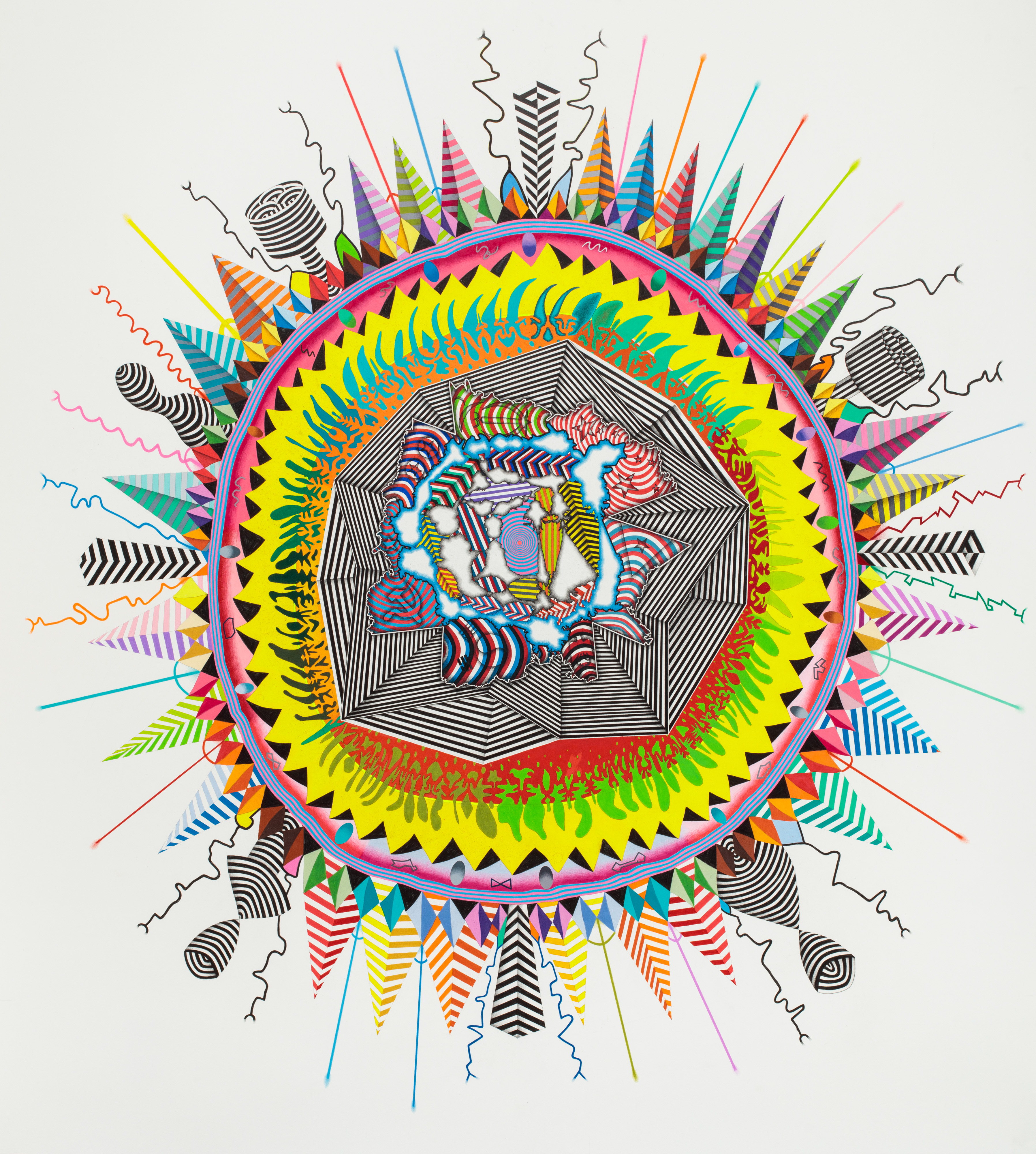
American Sun
79 x 71 inches, colored pencil and graphite on paper
Thoughts on this piece - I started by drawing a mirrored image of the United States in the center of the paper. I then traced the contours (coastlines) of the country's boundaries, flipped them, and then traced them again. I continued to do this as the shape grew, which created forms through the repetition... they looked like land masses or water bodies, so I treated it like a map and colored them accordingly. I thought of it as if the US sort of dropped into a pool and the ripples of its weight formed a planet in its wake. And the flag patterns are from countries that people online voted as the biggest threats to the US. I filled the 'land' forms with these flag patterns. Like the creator creates its own enemies or something... After that center area, though, I sat on it and couldn't decide where to take it. I kept thinking of it as a planet, but then the idea of the sun came to me. It's so simple but you know how something can be right there but you never see it... The sun as center of the universe, etc. So I extended that original mass in a kind of stylized, sunlike way... almost like an explosion, too. I thought the whole piece looked like a diagram of the sun or related planet, with its core (US), radiative zones (enemies), and resulting chromosphere, etc.
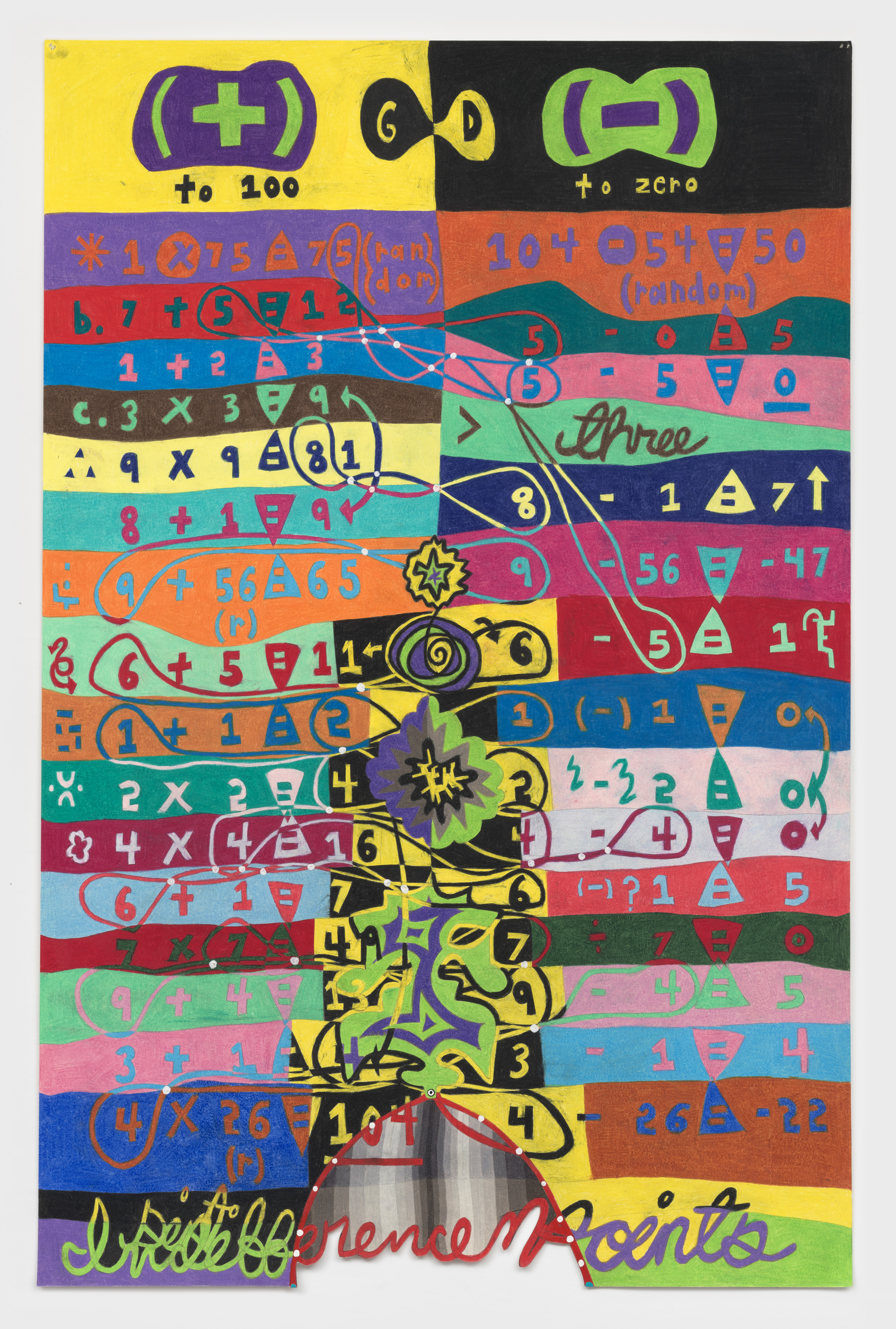
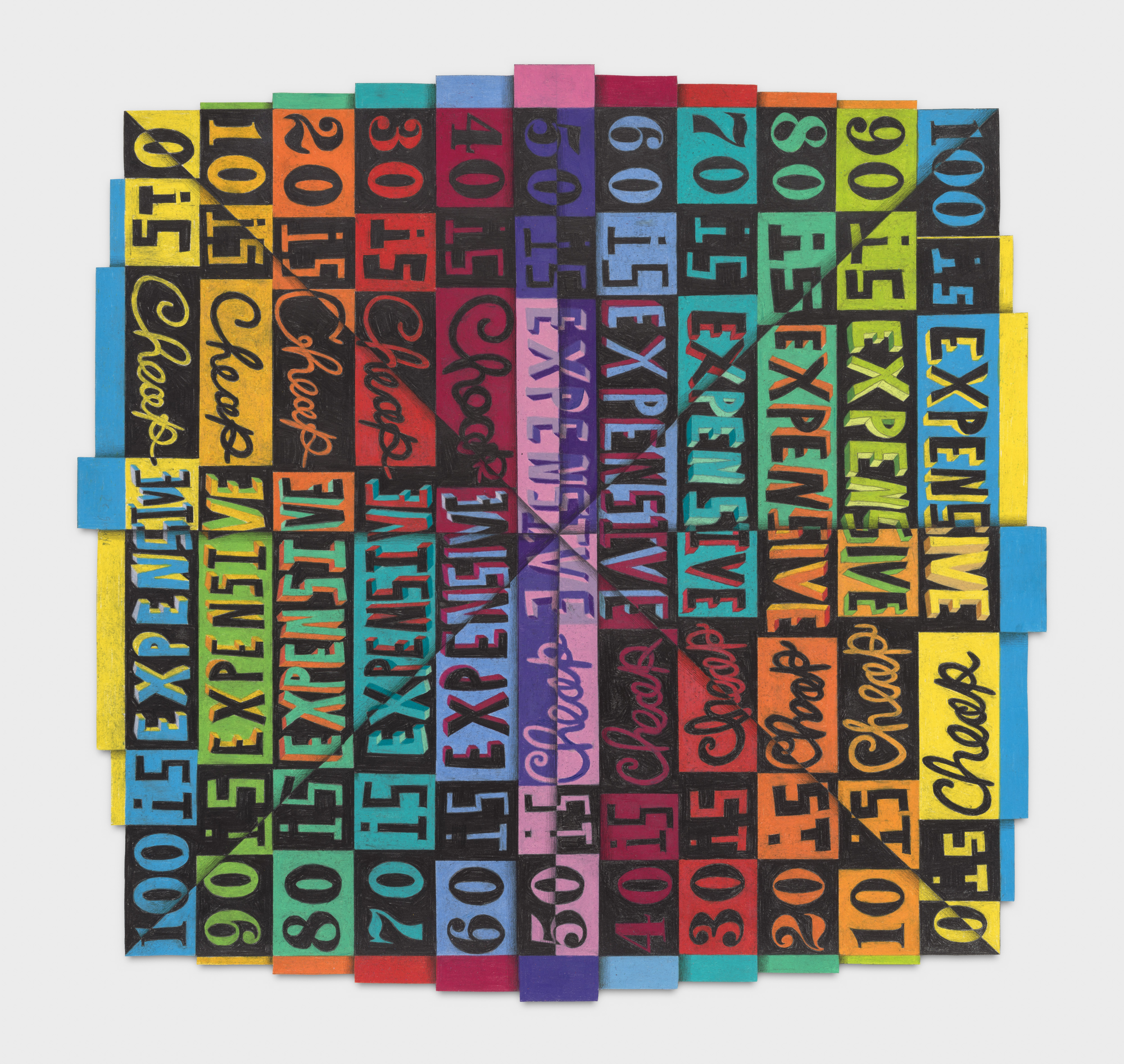
Point of Indifference
40 x 26 inches, colored pencil and graphite on paper
In this work, I tried to devise a mathematical model in which a certain quantity or both increases and decreases at the same time, achieving a state of equilibrium that demonstrates homeostasis. This model is a metaphor for the human life cycle, highlighting how we perceive our age in relation to two key points: our birth, starting at zero, and our death, an age that remains unknowable. Then, at middle age, there seems to be a moment — an indifference point — where significant psychological and emotional shifts occur, and our point of view shifts from the 0 of our birth to 100 (the number of the unknowable).
F O R C E
50 x 39 inches, colored pencil and graphite on paper
This drawing explores ideas of expansion and contraction through the evolution of combat weaponry. As violence expands via technological innovation and acquired mechanical wisdom, humanity will contract and eventually disappear. One big nuclear explosion and we’re all toast. In the drawing, the weapons begin at the top with the most primitive - two rocks - and progress downward according to the Fibonacci sequence – 3 fires, 5 sling shots, 8 knives – but then decline in reverse – 4 guns, 2 bombs, and 1 nuclear explosion. As each weapon becomes more sophisticated and subsequently has the potential to do more widespread damage, its physical size in the drawing exponentially decreases. I saw the whole piece structured like video game or a carnival game, with weapons lined up as if bouncing across a stage, gaining in power but shrinking in physical size, slowly killing themselves in the process.
Sophia and Jackson
60 x 48 inches, acrylic on panel
The names Sophia and Jackson were the most popular girl’s and boy’s names in the United States at the time I made this drawing. I follow their parallel lives, both beginning on July 4, 1982. Their early milestones align, smiles, first words, imaginary friends, suggesting equal beginnings. Each milestone is shaped by randomness, by fragments of my own experience, and by childhood psychology, its markers and its anomalies. Soon their paths diverge. Sophia turns inward, emotional and unspoken. Jackson turns outward, analytical and increasingly dark. Their preferences, Sophia’s red ovals and Jackson’s blue triangles, signal a symbolic split. Both encounter moments of ineffable perception, “something so stunning.” Sophia holds it within. Jackson speaks it aloud. Sophia becomes small. Jackson becomes large. Power, scale, and identity shift. Symmetry begins to fracture.
The dates, July 5, 2018 for Jackson and July 5, 2022 for Sophia, mark their deaths, each one day after their shared birthday. This symmetry binds them in deep entanglement while also rupturing their once-parallel lives. Sophia’s death is explicit, shot by Jackson in her bed. Jackson’s is ambiguous, possibly self-inflicted or symbolic. Whether they are siblings, opposites, or two facets of a single self, the symmetry of their endings blurs victim and perpetrator and collapses identity, memory, and violence into a single moment.
The work reflects on how identity shifts, sometimes quietly, sometimes violently, beneath the surface of what appears to be symmetry.
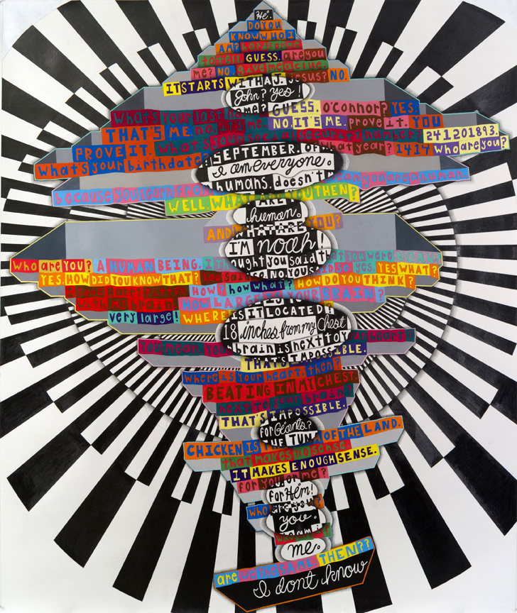
Noah Bot
83 x 69.5 inches, colored pencil and graphite on paper
Work commissioned by Darren Aronofsky for his movie "Noah.”
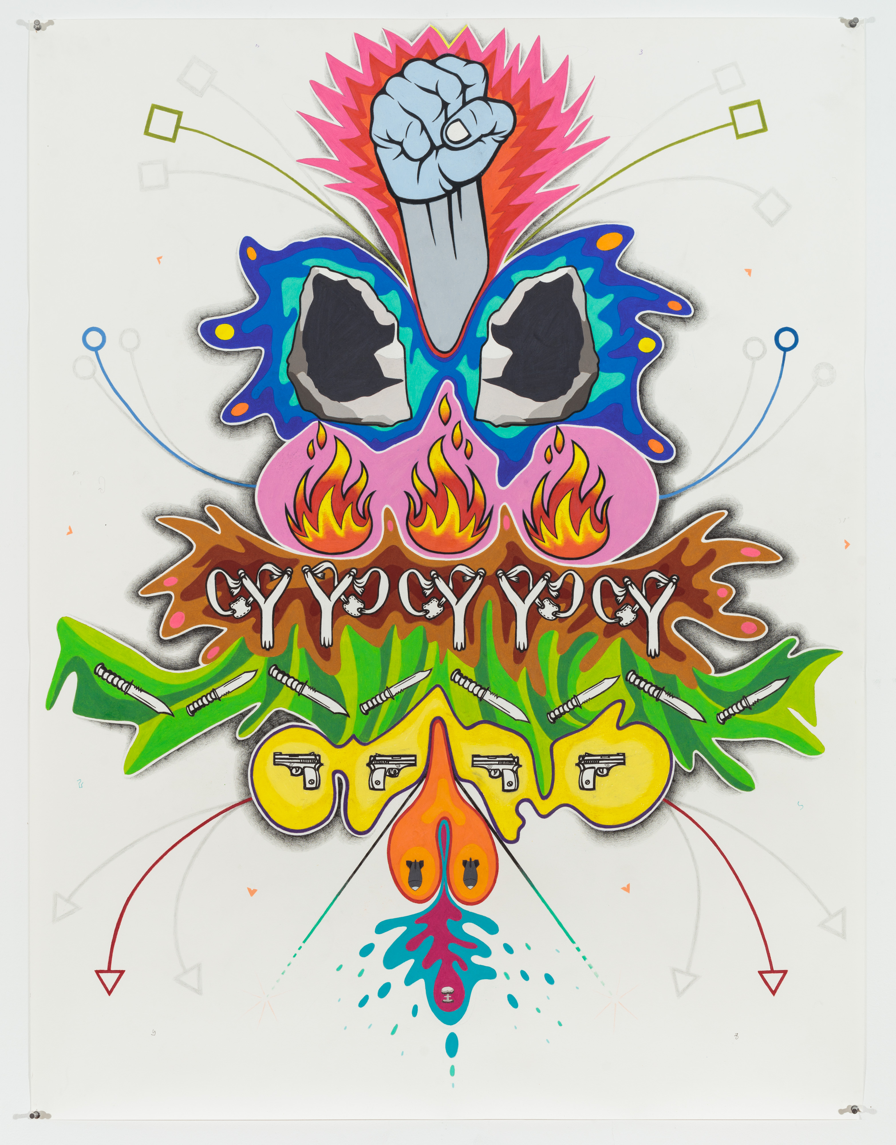
Butterfly
75.75 x 60 inches, colored pencil and graphite on paper
Story of a young man’s day, which is affected by the (legal and illegal) the drugs he takes at each decision-making step. His own intentions are therefore indiscernible from the cumulative effects of the stimulants and depressants he ingests, and the advertising he encounters
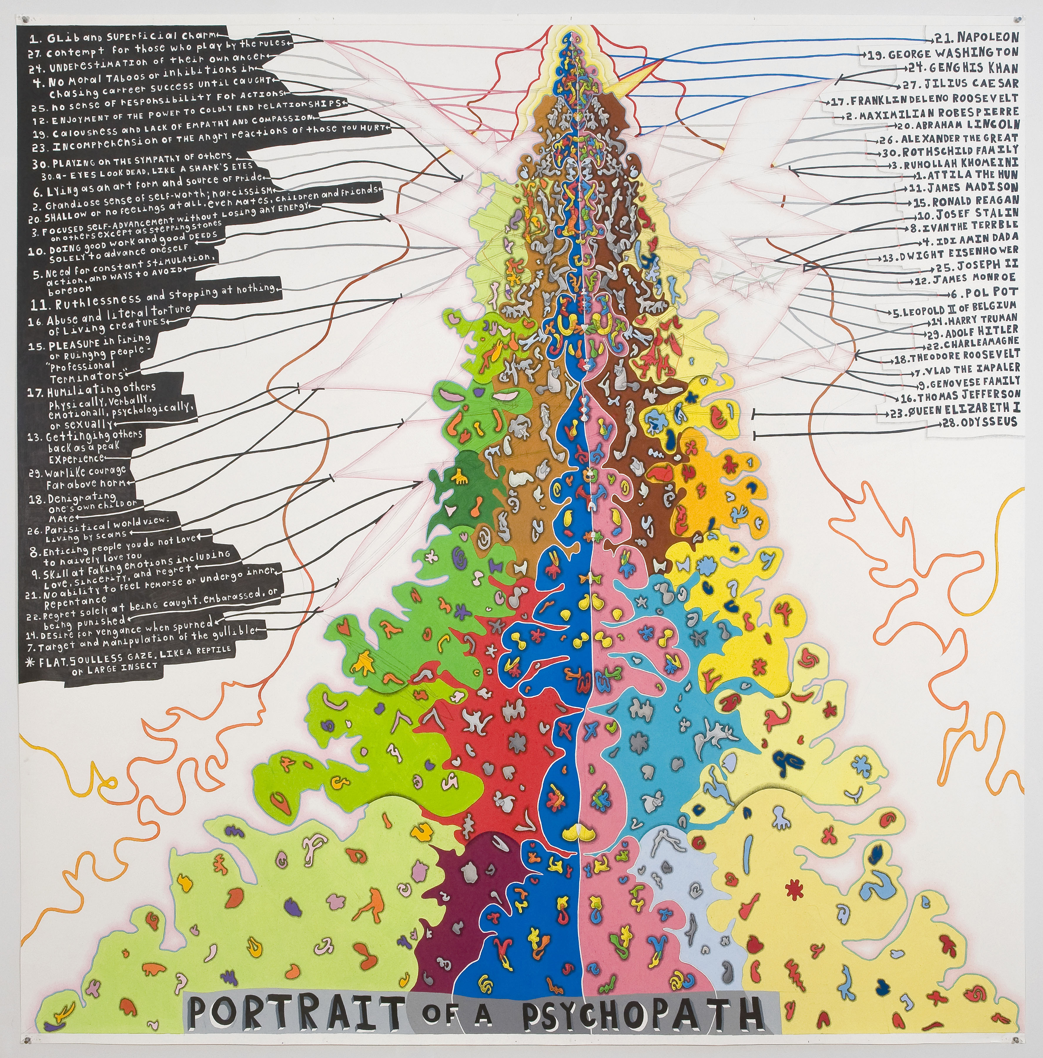
Psychopath
74 x 73 inches, colored pencil and graphite on paper
In this piece, I was thinking about the relationship between psychopaths and famous political leaders (the qualities that make a successful leader are often psychotic in nature), and about the mutation of psychopathic attributes over time, and within a species. On the left side of the piece, I listed a hybrid version of the clinical checklist for psychopathy, culled from various sources. I then connected these attributes (with physical lines) to the names of the most evil leaders throughout history, and the most successful presidents in US history, as anointed by internet voters. After linking these psychological attributes to my polarized list of historical leaders, I began to deconstruct these same links with the abstract forms in the center of the piece, which grew outward, organically. I drew a set of smaller shapes intuitively, trying to channel negative or positive energy through each, psychically. I then drew a dividing line down the center of the group - like a polarizing spine. I then began to copy these shapes, reversing them and redrawing them on the opposite side of the dividing line. The copies are more direct and specific around the spine, and more diffused and less exact as they move away towards the perimeter – like a magnetic field that weakens. Ultimately, these shapes were, to me, something akin to insects or bacteria that reproduced, mutated, or evolved across a field. They eventually invaded the text.
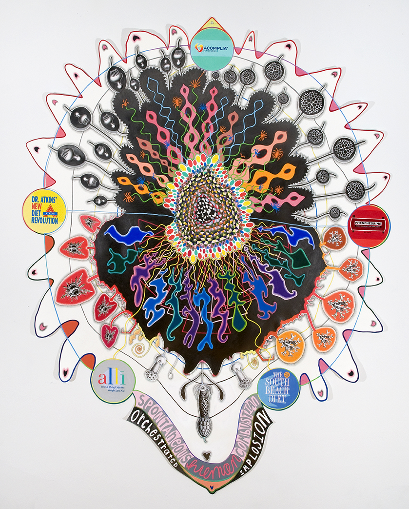
Implosion Explosion
74 x 73 inches, graphite and colored pencil on shaped paper
John Yau - "Consider 'Implosion or Explosion', a colored pencil and collage on a shaped piece of paper. It looks like a combination of a mandala, a stylized jellyfish, with its tentacles fanning out, and a cartoon explosion. According to the artist, the inspiration for the drawing was the “weight loss industry (commercial drugs and popular diet books) and the actual physical gain or loss of measurable weight in an individual.' For a moment the purpose of the drawing makes sense, but then the logic of it dissolves, which– for this viewer –doesn’t matter. The drawing is the astonishing residue of O’Connor’s research. Don’t we want to know if one of the diets cited in his drawing works? We know at least one must work at some level, don’t we? But does it do what it promises? O’Connor has a knack for tapping into the reservoir of curiosity and disbelief that – at one point or another – possesses us all." - Catalog Essay, 2013
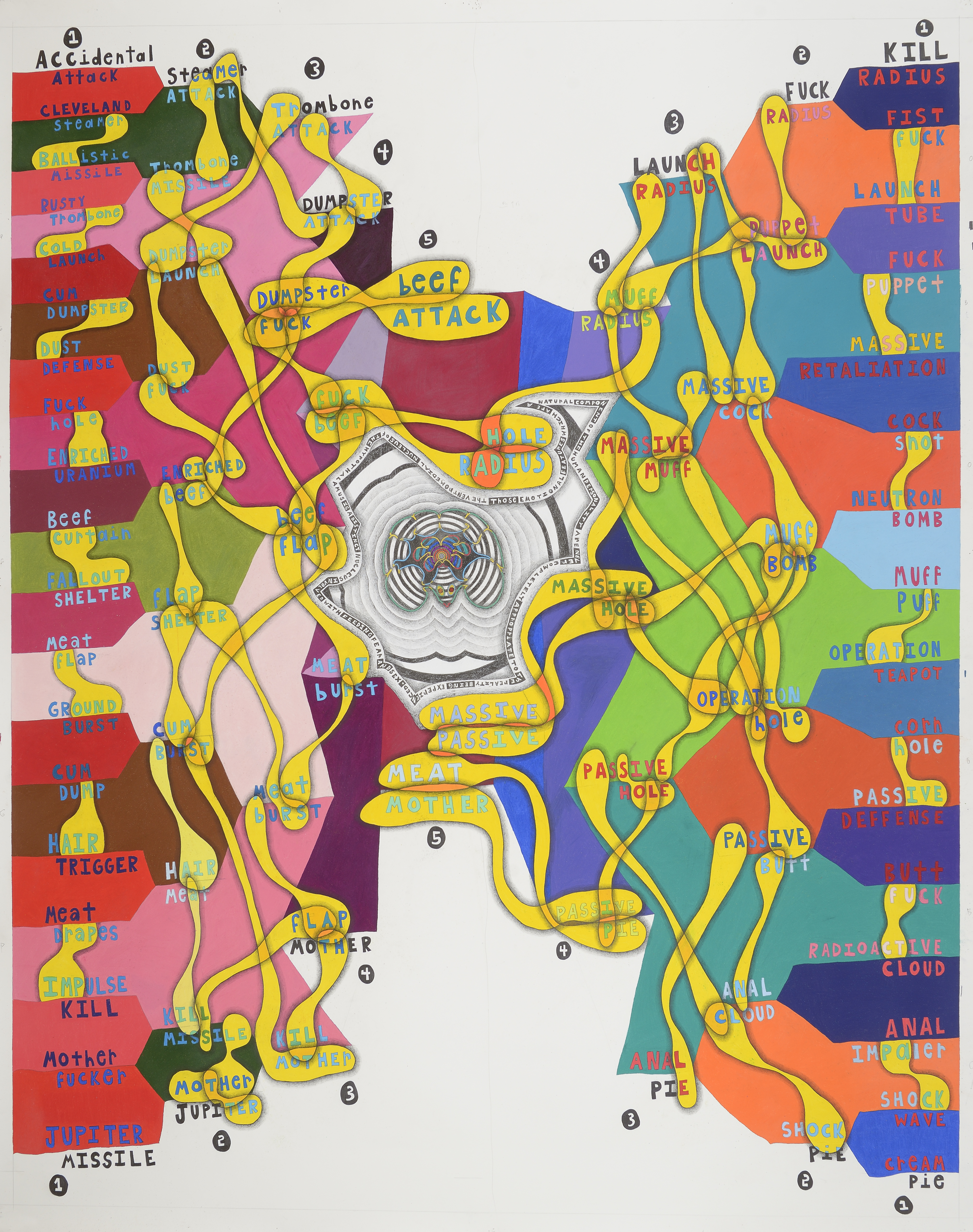
Sex and Violence
77 x 59 inches, graphite, colored pencil on paper
For this piece, I combined language from nuclear war with the most offensive sexual insults that one can say in the English language. I structured the drawing like a sports bracket, with a word from each pair “winning” and moving on to the next level of the bracket. The central form / pattern represents the area of the brain where sex and violence originate – the hypothalamus. It’s a place in the mind where violent impulses and sexual impulses may not be properly segregated from each other.
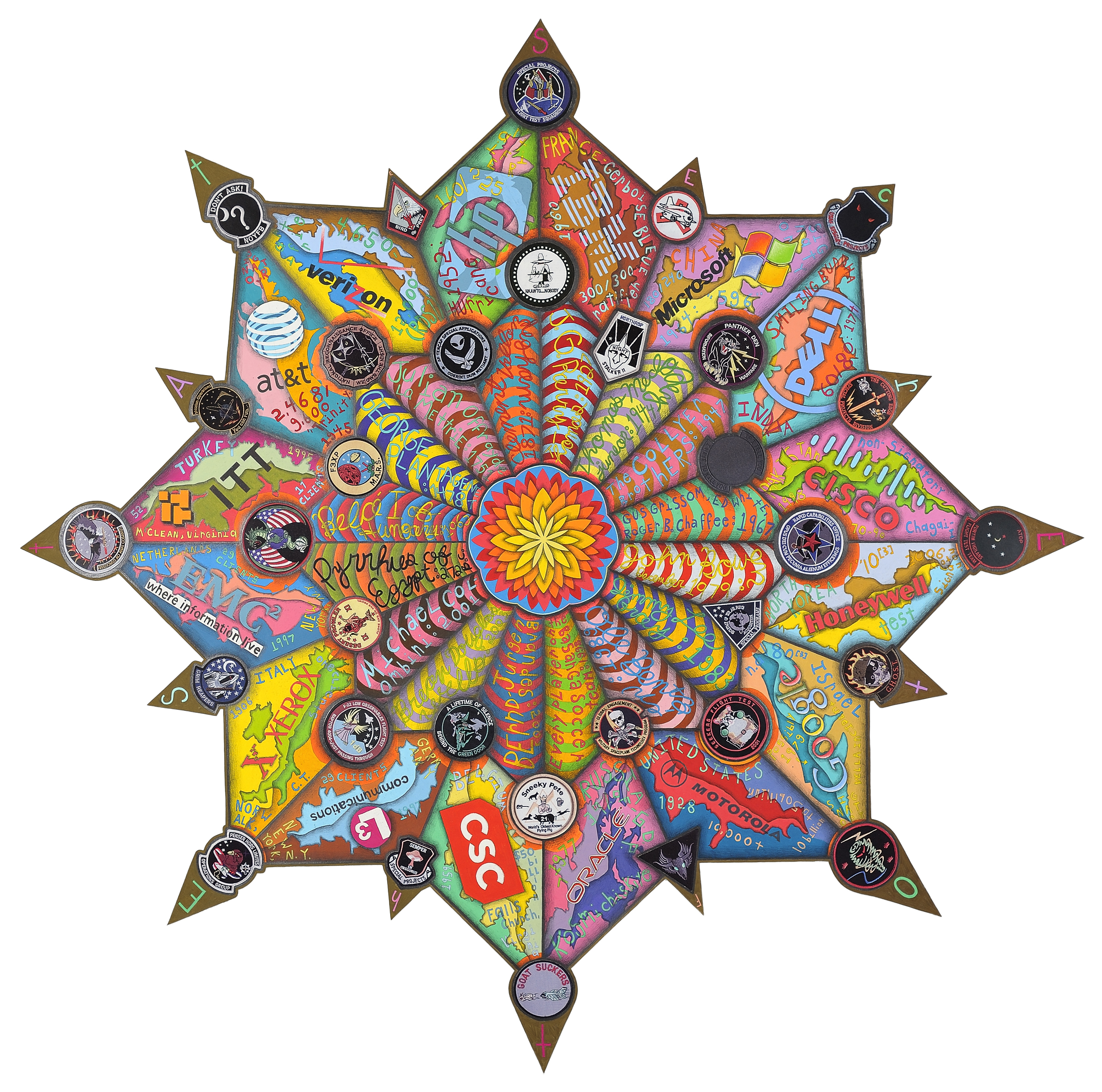
Secrets of the State (S.O.S.)
53 x 53 inches, collage, colored pencil and graphite on shaped paper
"'Secrets of the State,' culls from military patches for secret, real, or fictitious operations, the names of people throughout history who've died of mysterious causes (and the dates), and logos of corporations with direct connections to intelligence operations. It all makes total sense when O'Connor tells me about it, but the closer I look at the work, the more it becomes an impossible riddle, a Zen koan of sorts." - Bruce Pearson, Bomb Magazine, 2011
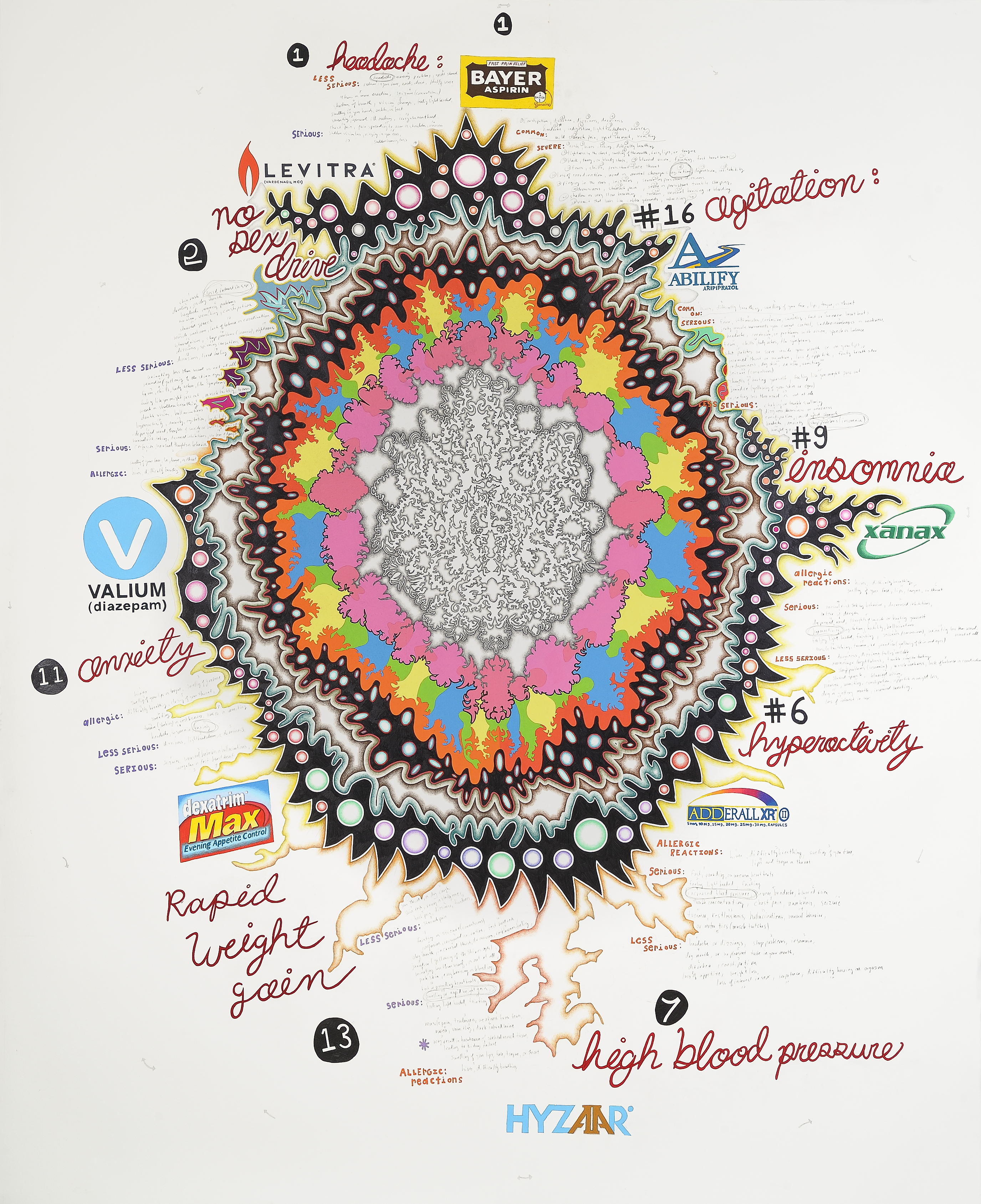
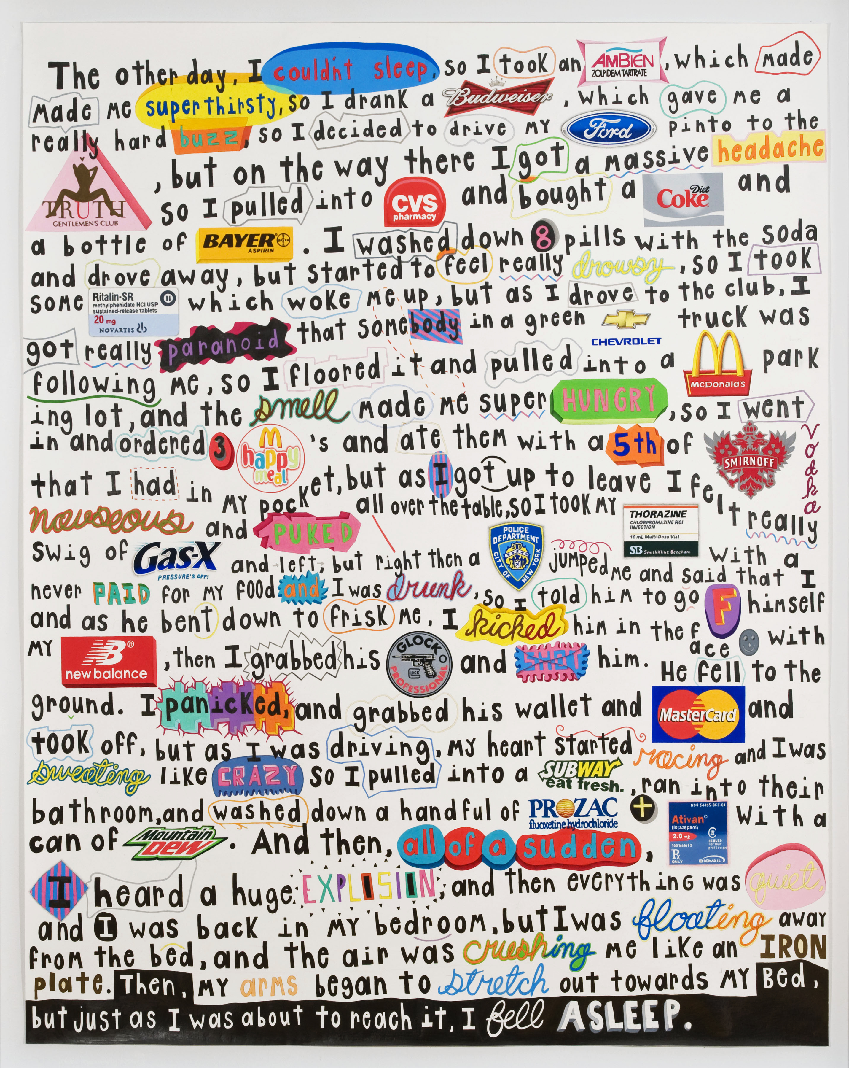
Drug Loop
88 3/8 x 72 inches, colored pencil and graphite on paper
"O’Connor develops his new works through a circular, or looping, process of one thing leading to another, and back to the beginning. His most recent and largest drawing, “Drug Loop,” reveals the circular effect of popular medications and their side effects. He begins at the top with “headache” and takes as solution, Bayer Aspirin. He then randomly selects from among listed side effects, chooses a new medication to treat the side effect, and so on around a central circular shape-from “no sex drive” to “hyperactivity,” “anxiety,” and, finally, “agitation.” - Susan Swenson (2011) In the center of the drawing, I began by drawing 2 small brain scans, connected - one of a healthy brain, and one with Alzheimer's disease. I then traced the contour of the 2 brains combined, flipped it, and redrew it around the first images. I continued this process of drawing and re-drawing the contours of each successive form, allowing the shape to grow organically, with small, almost imperceptible changes occurring with each phase. It was as if the specific shape of the original scans began to multiply and mutate, almost fractally, and eventually started to invade the medication ring.

Blood Pressure
77 1/2 x 70 inches, colored pencil and graphite on paper
To generate the multicolored bars in the center of this piece (the core of the work), I recorded my blood pressure each day as I entered the studio. I then invented a system to plot these daily measurements onto paper. As the structure moved across the paper, it eventually returned to my starting point, creating a loop.

Dr. Atkin’s Code of Independence
75.5 x 58 inches, acrylic, colored pencil and graphite on paper
I became inspired to make this drawing while looking at the ancient Egyptian grid systems employed to represent social hierarchy via a pharaoh’s idealism. The system I invented to generate the colors of the grid was based on the size of the language used in various texts – the lengths of words, sentences and paragraphs. It became an indecipherable code. I began the drawing by randomly scribbling across the paper. I then marked the intersection points of the lines and connected them to create the dominant shape in the work. Next, I drew the grid across the entire form and began to apply the system. The system linked the sizes of words, sentences and paragraphs to corresponding colors. For example, if a word was 5 letters in length, it would be red. If it was 10 letters long, it would be silver. The lengths of the sentences are also encoded this way. The sizes of the paragraphs are marked with alternating orange and violet pairs of squares. Finally, a change in text is marked by 4 fluorescent squares. I chose a wide range of texts to encode. I began with the Atkins’ Diet and included works such as Chaos, Declaration of Independence, Bible Code, Dante’s Inferno, How to Build a Time Machine, Rethinking Intuition, The Da Vinci Code and numerous others. The title of each text is written in proximity to its pattern on the grid. Lastly, the color of the larger areas along with the grey central section were determined through chance.
B(hsitir) C(ode)
36 x 52 inches, Acrylic ink, colored pencil and graphite on paper
This drawing is based on a public code posted via the Internet by the British Secret Service, MI6. They invited the public to try to solve it, and if one could, he or she may be offered acceptance into this secret organization.
Twenty Seven
42 x 28 inches, colored pencil and graphite on shaped paper
Horror Crash
75.5 x 58 inches, acrylic, colored pencil, collage, and graphite on paper
The NY Post headline "8 Die in Horror Crash" from July 28, 2009, was the starting point in this work. The Taconic is a road my family drives on often and by chance or luck missed avoided the road at 1:30 pm.
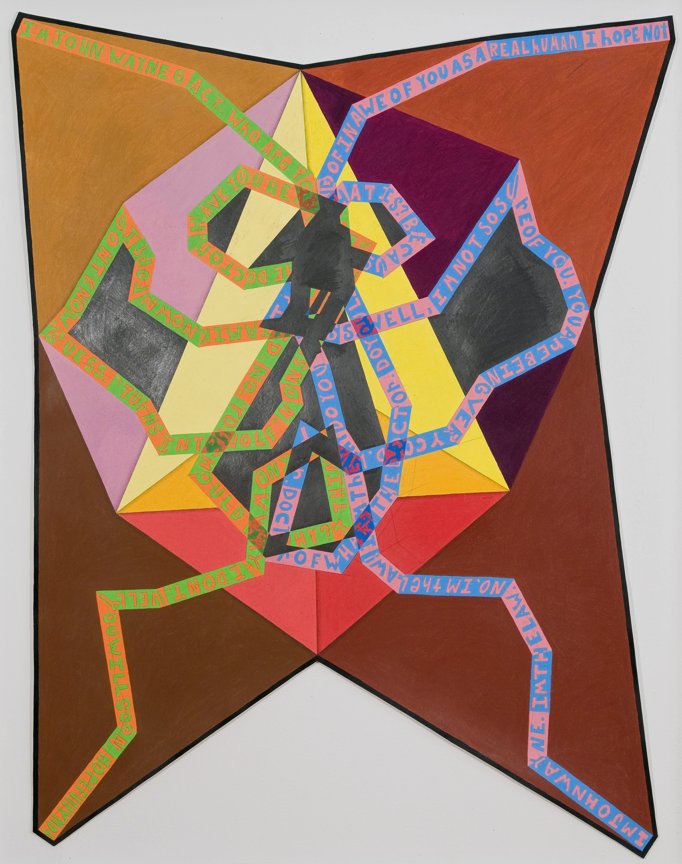
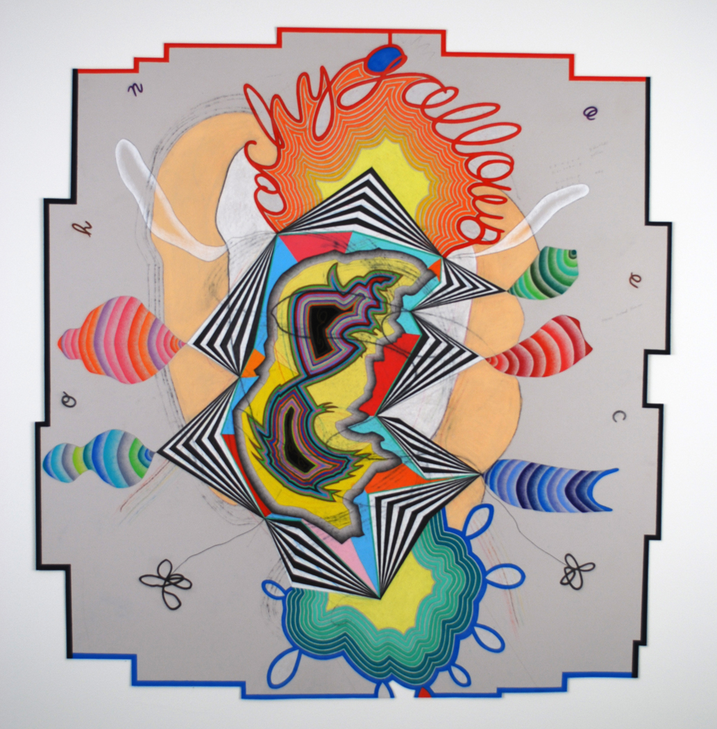
Wayne or Gacy
60 x 54 inches, colored pencil and graphite on shaped paper
Shaped-drawing based on two distinct conversations I had with Cleverbot (whose intelligence is based on collective human interactions). For the first conversation, I impersonated John Wayne, the actor and icon. For the second, I impersonated John Wayne Gacy, the serial killer and clown. The resulting conversations are intertwined throughout the structure of the piece.
A Good Idea
78.5 x 78.5 inches, colored pencil and graphite on paper
This work was my attempt to connect patterns of the past, present and future. I began with past disasters, connected them to current events, famous speeches, technological innovations, etc., and ended with predictions of the future. I tried to connect the information via the language that was used to describe the event – the last word or letter of a disaster from 1951 led me to the first word of another disaster from 1981.

The Walking Test
30 x 22.5 inches, acrylic, ink, colored pencil, graphite, and collage
A personal Turing Test. I tried to draw a shape in the center of the paper with both hands, from top to bottom, with each hand simultaneously mimicking the other.
Chest and Back
55 x 55 inches, acrylic, watercolor, graphite and colored pencil on paper
This work began when I mapped patterns of sun spots, blemishes, scars, and freckles on the front and back of my torso.
Apophis
58 3/4 x 48 1/2 inches, colored pencil and graphite on paper
Conceptually, this work is my attempt to visualize a prediction, by NASA scientists, that an asteroid called Apophis will strike the Earth in 2036. In Egyptian myth, Apophis was the ancient spirit of evil and destruction. The asteroid is 390 meters wide and could release more than 100,000 times the energy of the nuclear blast over Hiroshima. Thousands of square kilometers would be directly affected by the blast but the entire Earth would see the effects of the dust released into the atmosphere. To begin, I made stencils of the shape of the Hiroshima Bomb (before explosion), and the shape of the plume of smoke that resulted from its blast. I drew these stencils in the center of the paper, repeating them 100 times – in an attempt to connect the totality of the potential Apophis explosion to the Hiroshima bomb. Everything else in the work unfolded from this central shape (the explosion). I used the size of the explosion to determine the sizes and shapes of the outgrowths, or wings unfurling from the center. The word UNFOLD is written, in a now obsolete WW2 military code, on the perimeter of the form. The grey grid is made up of randomly applied grays, increasingly more numerous and darker toward the edges of the paper.
You Can’t Win
77.5 x 53.75 inches, acrylic, gesso, charcoal, ink, graphite and color on Paper
I built this work from the bottom to the top. In doing so, I invented ways of translating many different types of information about the lottery – social commentary, winning numbers, losing predictions, odds of winning, etc. into forms, shapes and patterns. My process was additive, incremental and inconsistent. The main conceptual / information-based layers of the work, from bottom to top, are: 1. Incorrect predictions of winning lottery numbers, which I translated into words via a simple system (each number corresponded to a letter – A=1, B=2, etc) 2. Purely random numbers (I translated them into numbers of shapes and patterns, colors, etc.) 3. Representations of religious symbols / crosses – signs of faith 4. Various written descriptions of the social implications of the lottery as described by various sociologists 5. Actual winning numbers for NY lottery 6. Average percentage chance of winning the lottery I thought of the whole thing as my building / drawing of a very unstable tower of sorts, based on the idea and implications of the lottery as a mechanism of social change.

Personal Space
80 x 75 inches, ink, gesso, acrylic, colored pencil, graphite on paper
This work is based on cultural differences in interpersonal space – the actual space people create between themselves and another person in casual conversation. Specifically, I used a study from 2004 in the Journal of Social Psychology of Dutch, English, French, Irish, Scottish, Greek, and Italian conceptions of personal space. The study looked at gender, pairs of people, and groups. The literal space was recorded for each group studied, and then averaged. I used these measurements to create the structure and patterns in this work. The length of the lines and sizes of shapes in my drawing correspond to the actual spaces (measured in the study) between people of different cultures. The patterns I made also reference these differences. In the center, I used photographs I took and found of people moving through crowds at parades – their patterns trying to navigate these spaces.
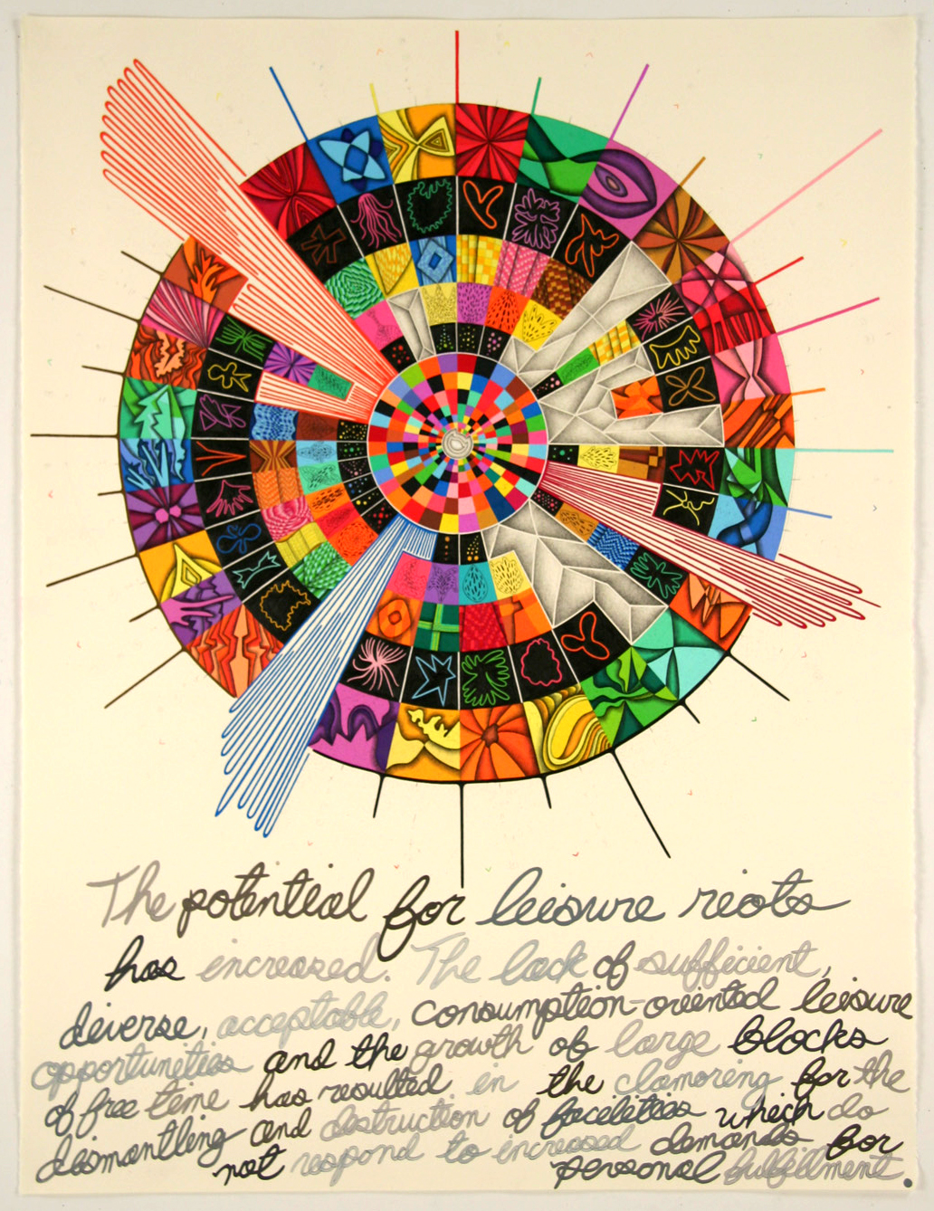
Leisure Riots
50 x 40 inches, graphite and colored pencil on paper
A prediction of the future, translated into abstract form and pattern. Back to its origin.
John Wayne 1
acrylic, colored pencil, pastel and graphite on paper
I began with 2 images projected onto the center of this work - John Wayne, the American icon, and John Wayne Gacy, the serial killer.

Unthinkable Behavior
37 x 28 inches, acrylic, ink, colored pencil and graphite on paper
The main text of this piece is based on an account of the Stanford Prison Experiment.
Weather Rocket
19 x 25 inches, Sumi ink, colored pencil and graphite on paper
2014
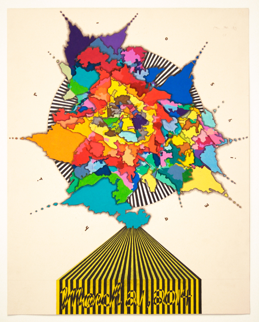
42 x 32 inches, colored pencil and graphite on paper
The conceptual basis of this work is my predicted (on deathclock.com) date of death: March 23, 2054. I translated this date into single digits and blindly turned a Rubik’s Cube the appropriate number of times. I then drew the resulting patterns from the cube to form the main shape of the work. I translated my death date again in the text below – numbers into letters, into words.
Defensive
54 x 43 inches, ink, graphite and colored pencil on paper
The central area of this work is comprised of overlapping, obscured words that I wrote in pastel. The words are from a 2005 study reported in the Guardian of the most offensive words in television. After writing the words, I outlined the contour(s) and extended these lines, in reverse, to the outer parts of the paper. Within these contours, I created patterns and forms that reference images and texts that are both clear and hidden – messages embedded within images. I thought of this duality as a metaphor for interpersonal interaction, where our impulses are hidden within casual communication, yet our facial and body language reveal complex patterns of thought.
Pay2Play
84 x 72 inches, graphite and colored pencil on paper
What would winning the lottery feel like? I began this work by sketching and gridding out the main oval shape. I then compiled the winning lottery numbers for the past year’s worth of games from different states across the country. I started with the NY State Lottery and used the last set of 5 winning numbers to generate a new zip code, which then led me to another state. I compiled the winning numbers from that state, and again used the last 5 numbers to generate a new zip code. I continued this until the drawing was finished. To form the central shape’s patterns, I created different color-based “codes” as a way to represent the numbers visually. I changed the color system as the pattern reached the center, creating a strata-like progression in visual complexity – for the outer layer, each color denotes a specific number, while for the innermost layer, colors only signify even or odd numbers. Simultaneously, I translated these same numbers into words. I set up a text-based encoding system based on the alphabet’s numerical equivalents (a=1, b=2, etc.). As each winning set of numbers generated a random set of letters, I then entered these random letters into a pocket dictionary, which searched for the closest approximated word. I then wrote these words around the central form, creating a (sort of) hand-written halo.

Death Cube
50 x 50 inches, colored pencil and graphite on paper
The conceptual basis of this work is my predicted (on deathclock.com) date of death: March 23, 2054. I translated this date into single digits and blindly turned a Rubik’s Cube the appropriate number of times. I then drew the resulting patterns from the cube to form the main shape of the work. I translated my death date again in the text below – numbers into letters, into words.
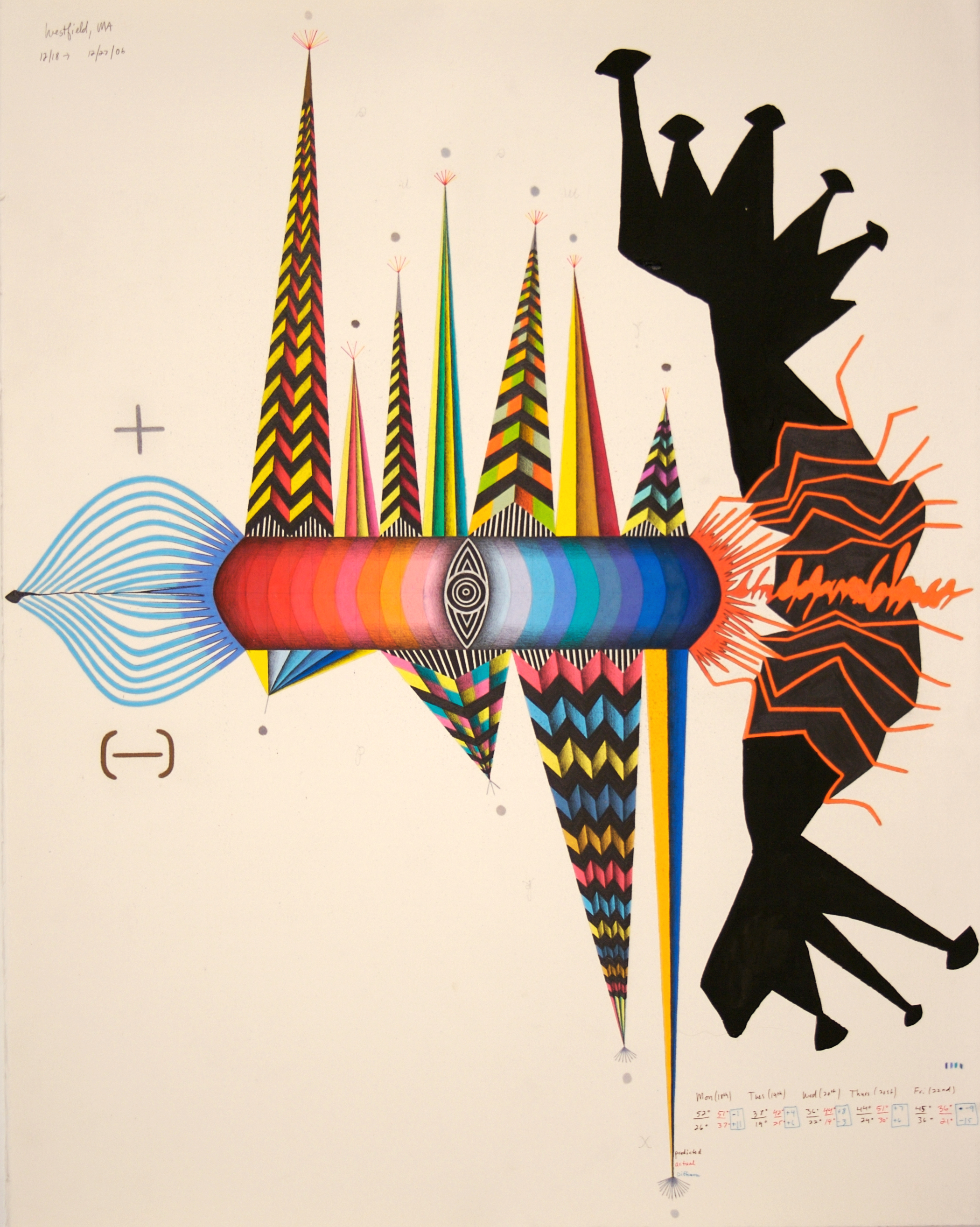
Prediction Error
60 x 89 inches, graphite, colored pencil on paper
The information that guided the direction of this drawing was the difference between predicted temperature and actual temperature in numerous US cities. Beginning in the center with Westfield, MA (my hometown), I recorded predicted high and low temperatures for 3 consecutive days. I then compared these forecasts with the actual recorded highs and lows for each day. Using a system I invented, I plotted these numerical temperature differences on the paper – they are a combination of circles, squares, etc. The system correlated the temperature differences with color (warm colors for warmer actual temps, cool color for cooler temps) and size. My system also connected temperature difference with direction – 3 degrees difference equaled 3 squares to the upper left, 4 degrees equaled 4 ovals to the lower right, etc.). After plotting the temperature differences for each of the 3 days, I used these same numbers to create a new zip code, which led me to another city, where I again recorded 3 days of predicted high and low temperatures and contrasted those with the actual temperatures. This process connected numerous cities in states such as Texas, Ohio, New York, and others. I continued to apply this system until the forms meandered off the paper. These looping lines and shapes created larger, more varied spaces. I measured the inner contours of these spaces and matched them with a list of the top ten natural disasters according to FEMA. The disasters and various related statistics are rendered within each space.
A Strings
41 x 32 inches, acrylic ink, colored pencil and graphite on paper
Star
53 x 47 inches, acrylic, ink, gesso on shaped board
Board shaped according to most recent Dow numbers, plotted via my own invented system as lines emanating from the center.
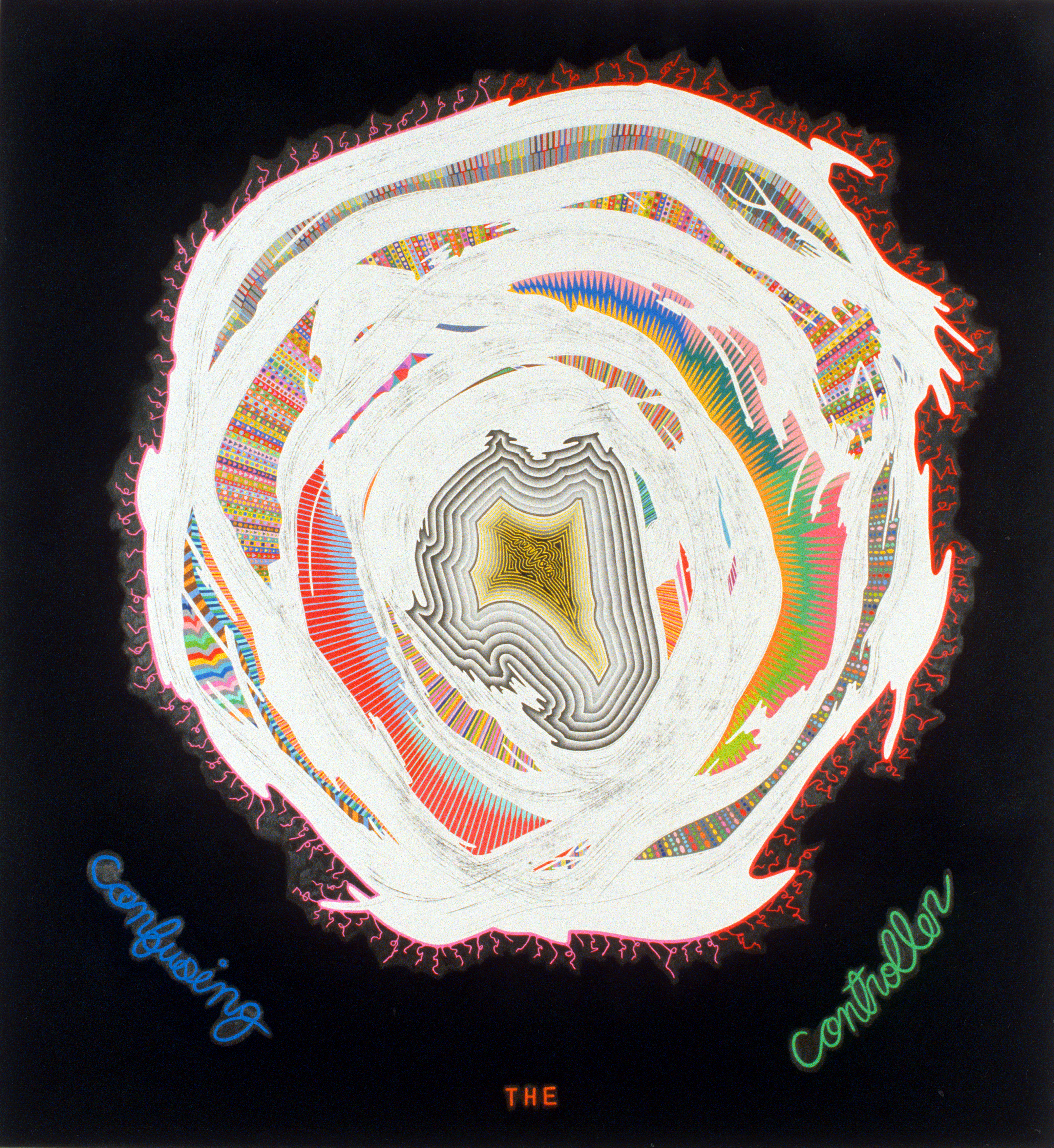
Dizzy
75 x 69 1/2 inches, charcoal, colored pencil and graphite on paper
Before starting this drawing, I glued together about 100 pencils into a large diamond shaped mass. Then, I spun myself around 33 times (my numerical age), making myself dizzy, and tried to draw a circle with the “pencil mass.” After this initial drawing act, I again spun around 33 times and attempted to mimic my original rendition of a circle. Finally, I spun around another 33 times and tried to draw the composite shape. In between these lines, I invented patterns that converged in the center. The outer text “confusing the controller” refers to the studies of the scientist Purdon Martin, who theorized that within the brain exists a “higher authority” or “controller” that helps regulate the body’s equilibrium.

Earthquakes and Wars
79 x 65 inches, graphite, colored pencil, gesso on paper
I began this drawing by recording the dates of the ten largest earthquakes and wars in the United States. I also recorded and included other pertinent information such as duration, location, severity, etc. The upper and lower stripes or bars correspond to the dates of the quakes and wars – the lengths of the stripes equal the dates (i.e. 1994 = 1 inch, 9 inches, etc.). I also developed a system to determine the color of each stripe. After I drew the stripes, I looked for patterns in the actual dates and the space(s) left between the sets of stripes. As with other works, I tried to look for similarities, an interconnectedness – principles or systems that may guide seemingly disparate phenomena. I tried various ways to create a form that would link the sets of bars and I eventually arrived at the organic central shape. To do this I measured from the end of each bar a distance based on the duration of the wars and the size of the quakes (translated into centimeters), and connected the resulting points. I thought of this process as a phase transition, in which one system is transformed into another. The information I placed throughout the drawing also relates to the conceptual similarities I observed. One concept that each phenomena seemed to have in common was the critical state, a kind of organization characterized by a tendency toward sudden and tumultuous change, one that seems to arise naturally under diverse conditions when a system gets pushed away from equilibrium. Another principle that I thought might determine the frequency of wars and quakes, was the butterfly effect. This effect, in which a simple occurrence can have much greater consequences, is what begins the process culminating in a critical state. I tried to make the central shape resemble the entirety of the butterfly effect, yet in reverse – it is at once a type of growth system and simultaneously a contained, definable form.
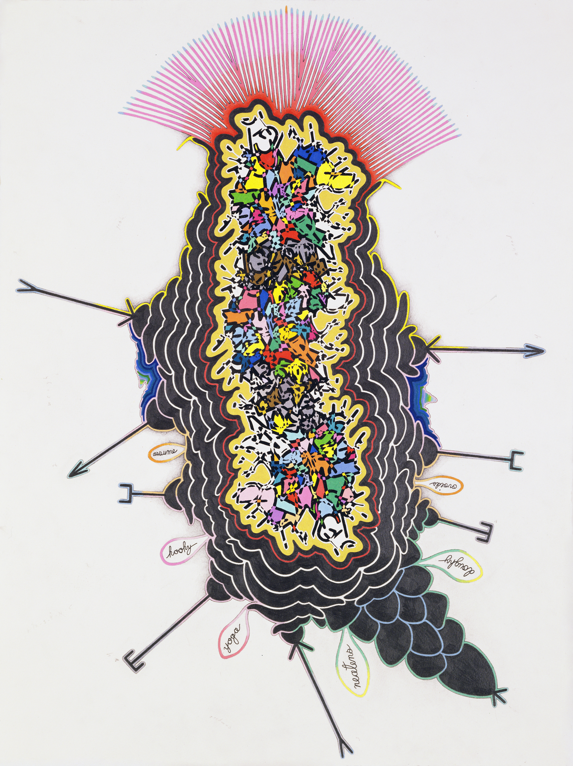
Kooky Yoga
46 x 35 inches, graphite, ink and colored pencil on paper
To begin this drawing, I transcribed several nights’ worth of my sleep talking (recorded with a voice activated recorder) directly onto the paper. I began in the center and rotated the paper with each word. After transcribing the information from the recordings, I outlined and darkened all the non-intersecting segments of the words and letters, creating a black and white pattern. Then, I colored the negative spaces between the letters. The outer words attached to this inner mass form a sentence: “Assume kooky yoga neatens doughy oviods”. These words were based on 6 nonsense mutterings from my sleep talking recordings. I transcribed them and entered them into my pocket dictionary, which translated the nonsense into actual words. I formed these into a sentence.
Nuzzied
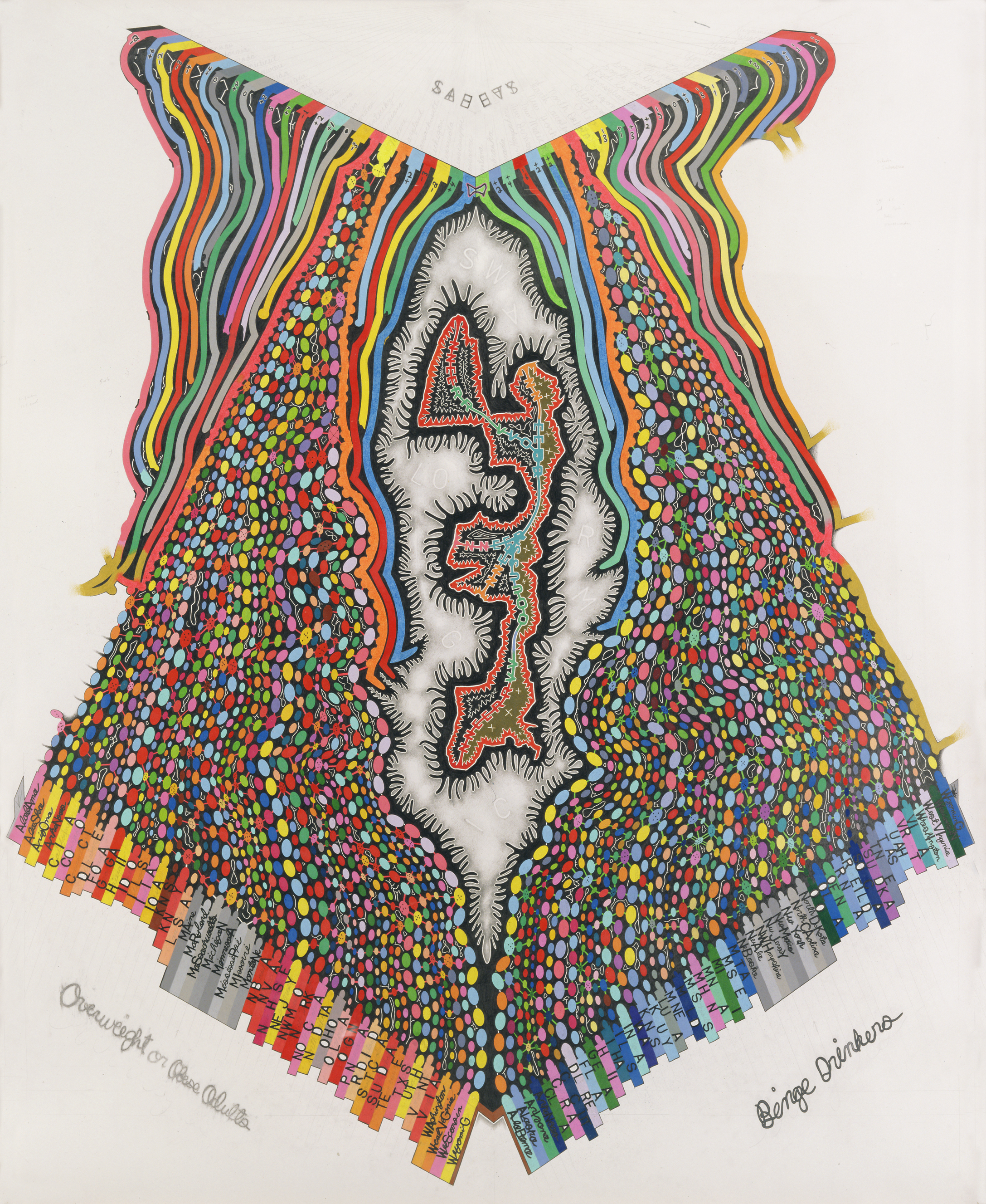
77 1/8 x 71 1/2 inches, colored pencil and graphite on paper
I derived the general shape/structure of Nuzzied after making myself dizzy. I spun around 31 times (my age) and then tried to draw 2 distinct, evenly spaced spirals (symbols of hypnosis): one circular and the other rectangular. A “core” emerged at the center-left, outlined in black – the result of the overlapping of each initial spiral. Within this core, the number of points comprising the central shapes corresponds to different U.S. state statistical averages of obesity and binge drinking. Similarly, throughout the drawing information is transformed and embedded within the initial drawing. I used contrasting formal elements to distinguish between layers of information and to maintain the integrity of the beginning spirals. For example, the number, color and size of various sets of stripes correspond to words and statistics. For this “coding” I incorporated numerous sources such as Oliver Sacks’s writings on balance, medical texts, lottery numbers, and US statistics relating to human “imbalance.” In addition, I made and employed stencils of the borderlines between the US, Canada and Mexico. I also referenced two identical clocks that I set two years ago simultaneously but which now have greatly divergent times. And the random fragments of residual color remaining on the contours guided the direction of the string-like bands surrounding the main form. Overall, my formal and conceptual interests are integrated into a web of balance and imbalance derived from my dizziness.
Nostradamus
52 1/2 x 82 inches, colored pencil, graphite and gesso on paper
A Nostradamus prophecy predicting religious turmoil and wars was the foundation of this drawing. I began by translating three manifestations of the prophecy – the original French version, the English translation and the editor’s summary – into inches and centimeters. Emanating from the upper center, I plotted each letter of the original text in inches (A=1 inch, B=2 inches, etc.). I then translated the English version’s letters into inches and connected them to the original lines, at different angles. Finally, I connected the editor’s summary. The overlapping lines created a dominant inner shape, which I reinforced with solid graphite and grey colored pencil. Several lines extended outward from the perimeter of this form, which I capped with circles and filled with patterns derived from their distances from the perimeter. In the lower section of the drawing, there are other textual references to the prophecy. I counted the number of letters in each word of Nostradamus’s original writing, and chose an equivalent amount of random numbers (1 to 26). For example, if Nostradamus’s original written word had 3 letters, I then chose 3 random numbers from 1 to 26. I then re-translated these numbers back into letters and entered the random configurations into my pocket dictionary, which searched for the closest English approximation. The resulting words are interspersed throughout portions of the drawing. I also included the punctuation of the Nostradamus text, and a portion of his original writing appears outside the yellow bands, written in cursive.
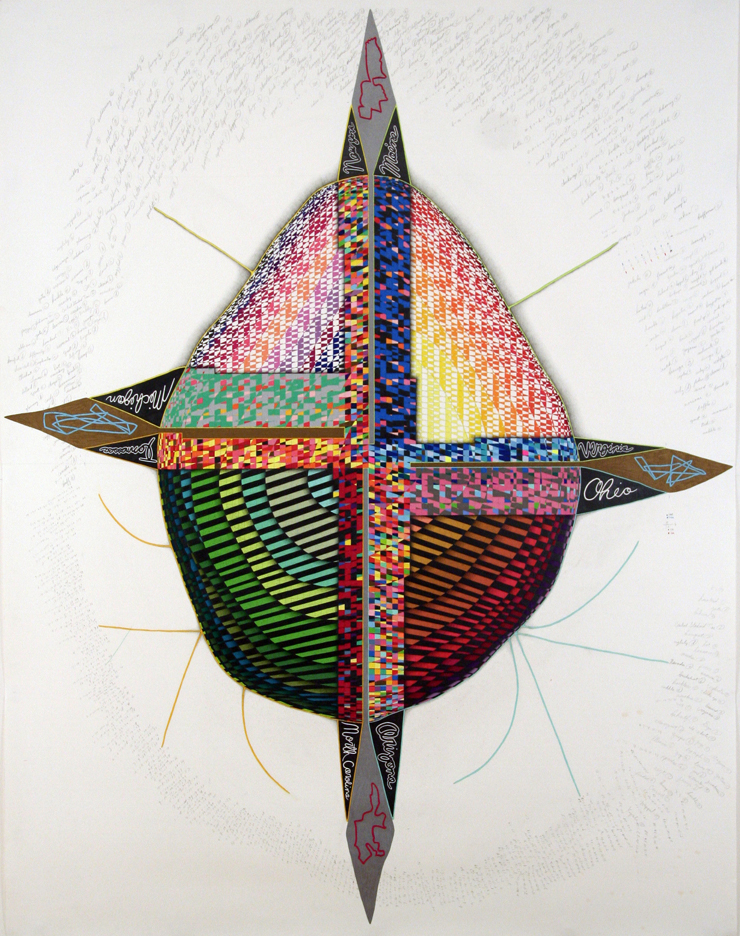
Local
76 x 64 inches, graphite and colored pencil on paper
The potential relationship between state percentages of obese and overweight adults, binge drinkers, and the overall safety rating for each state in the US was the impetus for this drawing. I began by recording and marking the ranking for states in each category according to 2002/03 statistics. The ovals reflect each state’s numerical ranking. In addition, I invented a distinct method to record state percentages in each category in terms of size and color. The “stripes” for the safest state rankings at the top correspond to the number and size (eventual length) of ovals initially recorded for each. After recording and transforming this data, I looked for various visual and conceptual connections. The shape in the center is an altered representation of the top state in each category (MN, MI, LA, MS). I formed this by connecting all four states on a map in the most efficient way possible. Throughout the drawing, I outlined shapes to demarcate the inner spaces between forms – these are denoted by the thin white looping lines and are a type of pattern mapping. I also incorporated information relating to pertinent process at work in these emergent systems, such as swarm logic and the human nervous system. To this extent, I attempted to connect the human body and insect colony formations with obesity, binge drinking, and the relative safety of each US State.
Husky
86 x 86 inches, graphite and colored pencil on paper
Over the past several years, I have been recording my daily weight fluctuations. Before beginning this work, I consolidated these recordings in order to eliminate repeat weights. In the drawing, I derived the size of the central circle by averaging my weight for the past 4 years and subtracting the result from my ideal weight (according to the Department of Health). Then, I added up all of the single-digit, common numbers from my weight chart and came up with 42, represented by the finger-like extensions emanating from the circle. The next level of solidly colored leaf-like shapes resulted from another interpretation of my weight changes. Emanating from the concave sections of the red form, the length of each “leaf” equals a specific physical weight multiplied and then divided by others, translated into centimeters. I multiplied or divided according to whether the weight was even or odd / small or large. The colors (cool or warm) also corresponded to those number qualities. The next structural section growing from these leaf-like forms came about after I translated my weights into letters and then into words, via a pocket dictionary. Then, I re-translated the new words back into numbers and plotted them as tentacle-like, looping extensions. Some of the information within these and the other spaces was derived from the following: references to state statistics of obesity and binge drinking; the exact middle sections of anatomy books (diagrams from these pages); the negative spaces in between the circulatory and vascular system; baldness progression diagrams; every word in the thesaurus for fat, with the middle letter removed. The black and white central snowflake shape was the final piece of the drawing. I made it by tracing and then overlapping the negative spaces of various paintings and sculptures from Greek and Renaissance history, such as the Spear Bearer and Michelangelo’s Moses. Lastly, interspersed throughout the work is information pertaining to the systems and processes in the drawing.
Mexada
82 x 52 inches, graphite and colored pencil on paper
In making this work I attempted to explore the nuances of balance and separation as manifested in borderlines – manmade and self-forming. The central, structural lines of the drawing resulted from my random application of the borderlines between the US and Canada, and the US and Mexico. I initially made stencils from a small map and applied the resulting borderlines to the paper based on a system I invented, which was based on various sets of winning NY lottery numbers and originated in the center. If the lottery number was even, I applied the Canada/US border stencil. If it was odd, then I applied the Mexico/US border. The direction of the lines, ranging from North, South, East, West and all combinations in between, was also dictated by the given lottery number. Each line connected to the other, creating a complex, looping web of intricate contours. After I created this set of lines, I delineated the central island-like form. Within that island, I isolated another more 3-dimensional form/shape and colored its state-like sections with cool and warm colors. The black and white lower section of the drawing was my attempt to organize, through geometric repetition, the sprawling borderline combinations. The upper dome-like portion of the drawing contains a wide range of information relating to historical hierarchies and mythologies: Greek and Roman gods, the plagues of Egypt, prophecies of Nostradamus, and various conceptions of heaven and hell. In the central, shaded portion, the organic shape originated in an Oliver Sacks article on balance. I hand-copied two portions of his text in opposite directions and outlined the shapes in between the words. Other pieces of information are spread throughout the drawing and reflect my thought processes, information gathering, and aesthetic trials.

Ebbinghaus Map
72 x 65 inches, graphite and colored pencil on paper
I was inspired to make this drawing by the theories of the German 19th-century scientist Hermann Ebbinghaus. He quantified transience. His theory was that memory of random or impersonal "things" fades over time at predictable rates. I decided to test this theory on myself, visually. In the drawing, I began with an all-over, numbered grid. Using sets of lottery numbers applied to the grid, I created an initial shape. I then tried to test my memory of this chance-derived form. To do this, I stood at arms’ length, closed my eyes, and attempted to redraw the shape, section by section. This process eventually resulted in the final, more complex form. The patterns and information included in and around the form reflect the history of the drawing in addition to my conceptual and aesthetic decision-making.
Clumsy
30 x 22 inches, graphite, colored pencil, ink on paper
Head Itch
64 x 64 inches, graphite and colored pencil on paper
To begin this work, I tried to make myself have an itch by concentrating on creating its sensation. I repeated this process several times. I began by recording when, where, and at what ambient temperature an itch developed on my head. Then, I marked the actual location of the itch on my head with a marker, and transcribed the location point onto paper. The paper was divided into quadrants corresponding to the front, back, top, left and right areas of my head. The notations are in letterform and were derived from the temperature I recorded at each itch (i.e. 81.2° equals 8+1+2, or 11, or the letter K). Next, I connected all the letters into the centralized form and attempted to delineate the pattern of my itching, which was concentrated on my face. Additionally, the small, satellite-like forms on the perimeter are the various times of the itches in each quadrant, overlapped.
The Middle
80.25 x 60 inches, graphite and colored pencil on paper
For this work, I tried to reveal patterns possibly embedded in the written and spoken language of a wide range of sources – casual, formal, personal, political, etc. In the upper half of the drawing, I used the first several sentences of each source (the beginnings of stories), defining the patterns of speech by letter type. In the lower half, I used the last sentences of the same sources (the ends of the stories), defining the patterns again by letter type. The patterns I chose evolved and changed as I worked.
A Revolution
68 x 65 inches, acrylic, ink, graphite on paper
Underpainting of hypnotic phases to be repeated by a facilitator in a session. On top, I painted and drew numbers from the progression of the Dow throughout history. The historic numbers intermingled with random ones.
Oh, I’m Sorry
46 x 44 inches, graphite and colored pencil on paper
I’ve been recording myself “talking” in my sleep for about five years. For this drawing, I transcribed several years’ worth of talking directly onto the paper. I began in the center and rotated the paper with each word., overlapping words, letters and sentences randomly. After transcribing the information from the recordings, I was left with a small central shape. Within this shape I reproduced a segment of a scientific diagram representing a receptor in the brain that contributes to memory reinforcement. Supporting this whole cluster is the hippocampus, written below.
2025
83 x 66 inches, graphite, colored pencil, ink on paper
L. Stephen Wolfe and R. L. Wysack have predicted that, in 2025, the world will reach a state of eternal peace and prosperity, and will unify through a common language spoken by all. For this work, I translated their prediction into an abstract form, using the actual language of their prophesy (its structure and pattern) as a starting point. I plotted and then connected into a continual loop, the letters of each word on a 26 by 26 point grid, each letter became a coordinate. I wrote the literal prediction below – the colors of the letters correspond to the colors of the looping form above. The shapes in the lower section come from possible forms of Pangea Ultima.

Scratch
74 x 65 inches, graphite and colored pencil on paper
This work began as an investigation into the causes of itching – as a potential result of physical and/or mental stresses. I began by recording when, where, and at what temperature and time I had an itch. At various times, I tried to make myself itch by concentrating on the sensation. I then recorded the points on my body (with a Sharpie) where I felt an itch and then transcribed them to the paper, which was cut to my exact height. The orientation of the “X marks” correspond to the parts of my body (i.e. an X slanted to the right equals an itch on my back, etc.). After noting all the points, I tried to look for and demarcate a pattern. The circular areas, in addition to the lines that differentiate the layers of pattern, are the result of my initial attempts to connect the points – I utilized the “searching” lines as the foundations for the overall structure. In addition, the information I included within the form(s) relates both to current theories of itch sensation and to some of my own conclusions.
SUSEJ
43 x 25 inches, colored pencil on graph paper
The first words of the Bible, translated into colors, make up the square, innermost pattern of this drawing. Each alternating, colored square represents a different letter from a word, in sequence. Surrounding / containing the Bible square is a randomly generated shape, based on the same system that I used to translate the Bible into color.
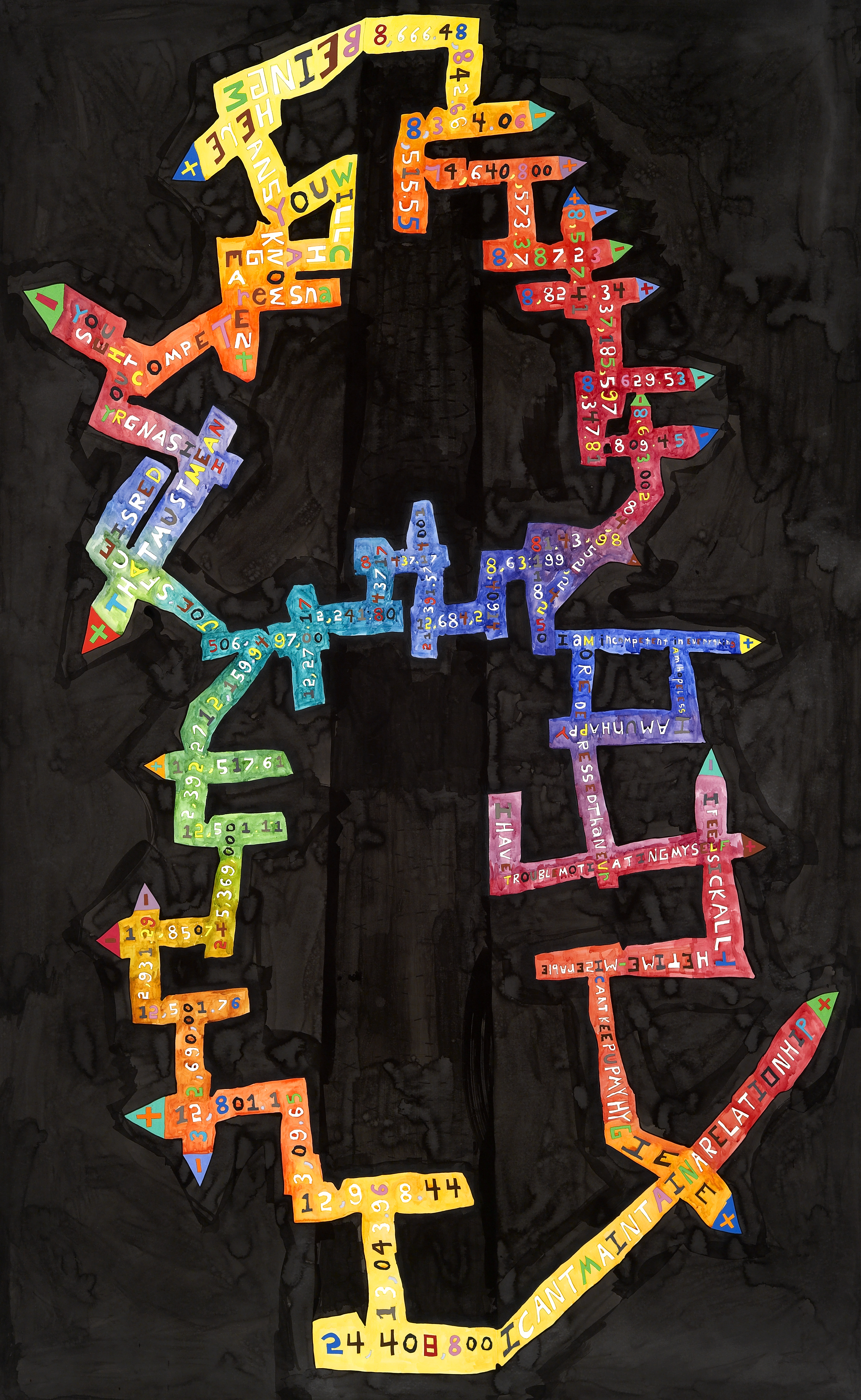
Highs and Lows 1
80 x 60 inches, watercolor, ink, colored pencil and graphite on paper
Largest rises and largest falls in the history of the stock market, connected according to my own invented system. I juxtaposed and connected this structure with statements of great confidence and insecurity, revealed through hypnosis.

Highs and Lows 2
80 x 61 inches, watercolor, ink, colored pencil and graphite on paper
Second version - Largest rises and largest falls in the history of the stock market, connected according to my own invented system. I juxtaposed and connected this structure with statements of great confidence and insecurity, revealed through hypnosis.